Promotions
Responsive Web
eCommerce
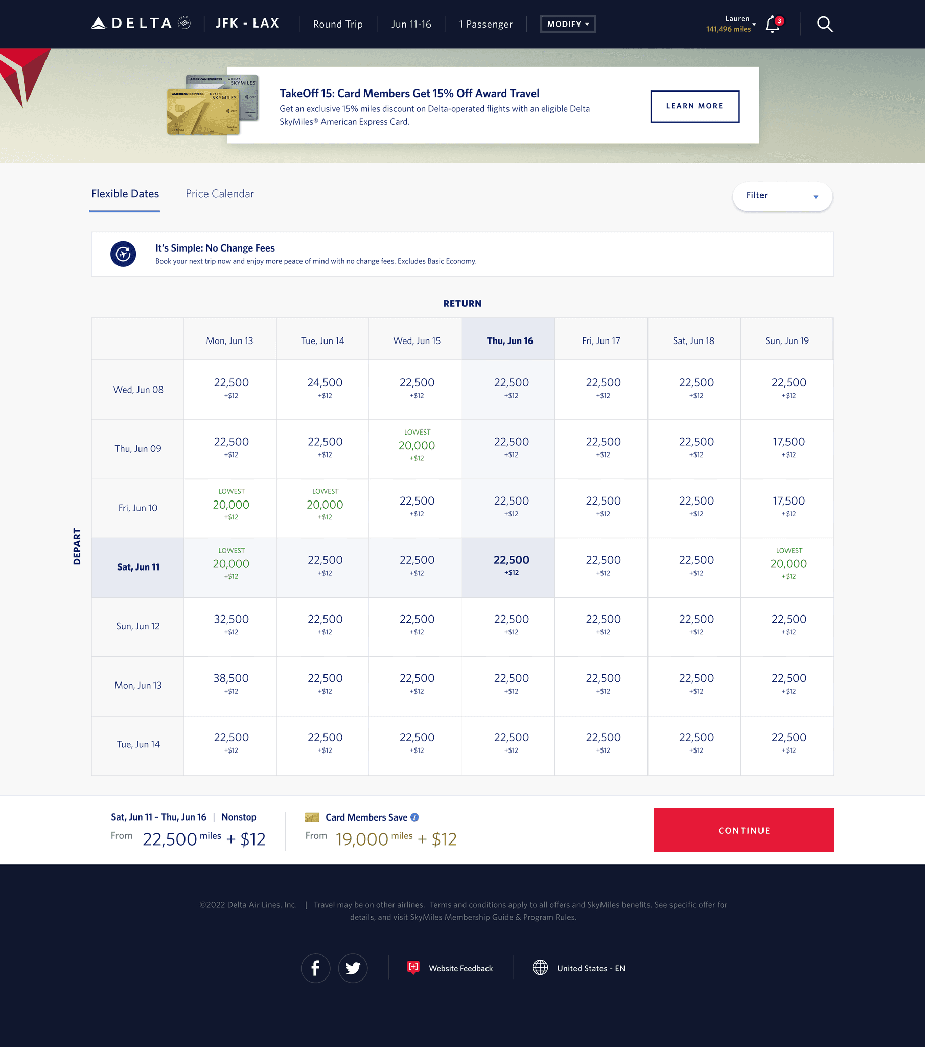

About American Express and Delta Airlines Partnerships
American Express and Delta Air Lines have a partnership offering exclusive benefits and rewards to their customers. Cardmembers earn Delta SkyMiles with eligible purchases and enjoy perks like priority boarding, checked bags, and access to Delta Sky Clubs, enhancing their travel experience.
Features and Requirements
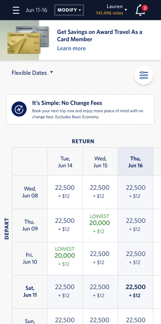
Delta and AMEX will launch a promotion that provides exclusive savings to card members while shopping with miles on select flights
Create unique experience for the 4 different tiers of AMEX cards and for non card members
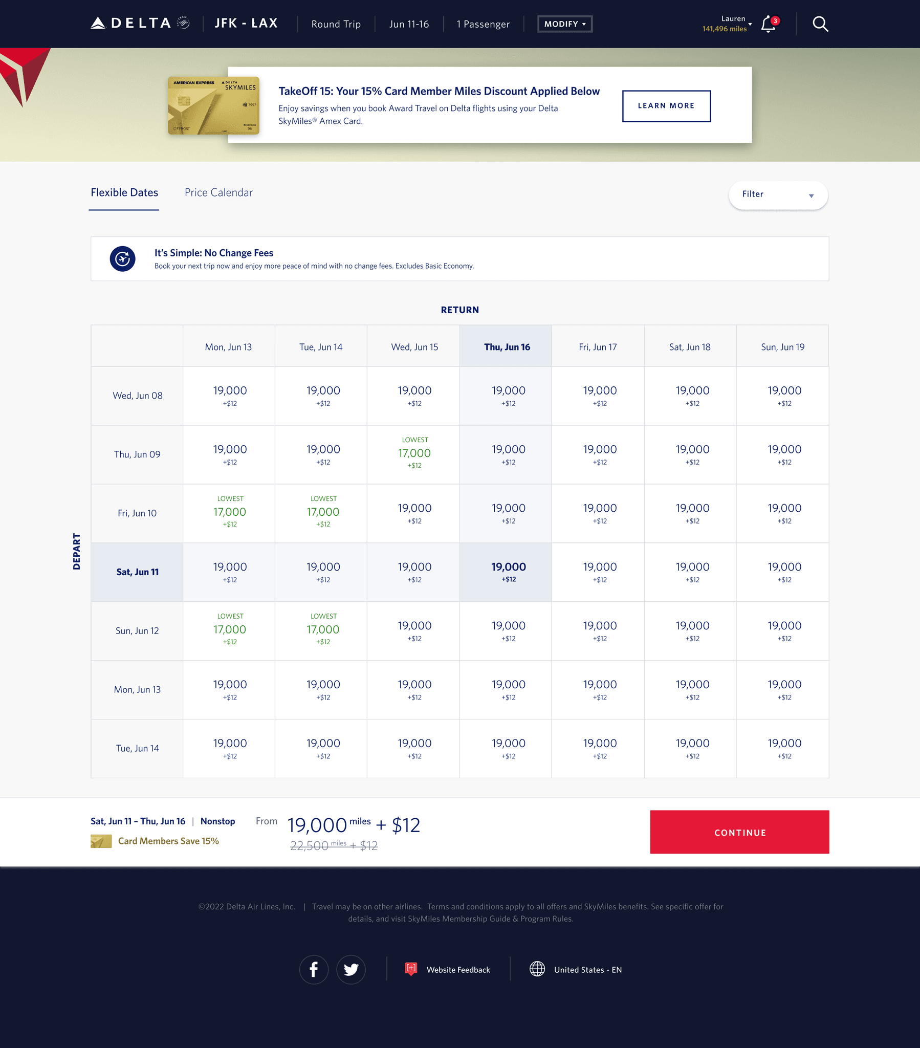
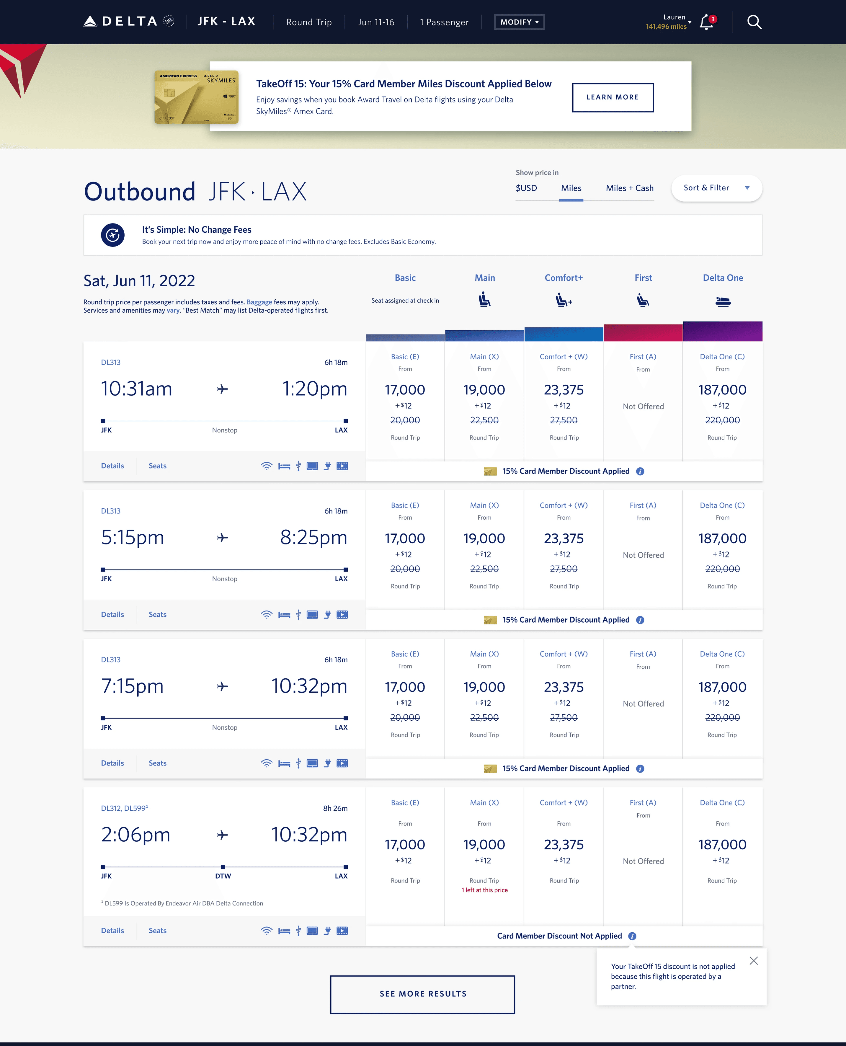
Discounted pricing prominently displayed throughout the search and purchase flow, ensuring a seamless booking process
Approach
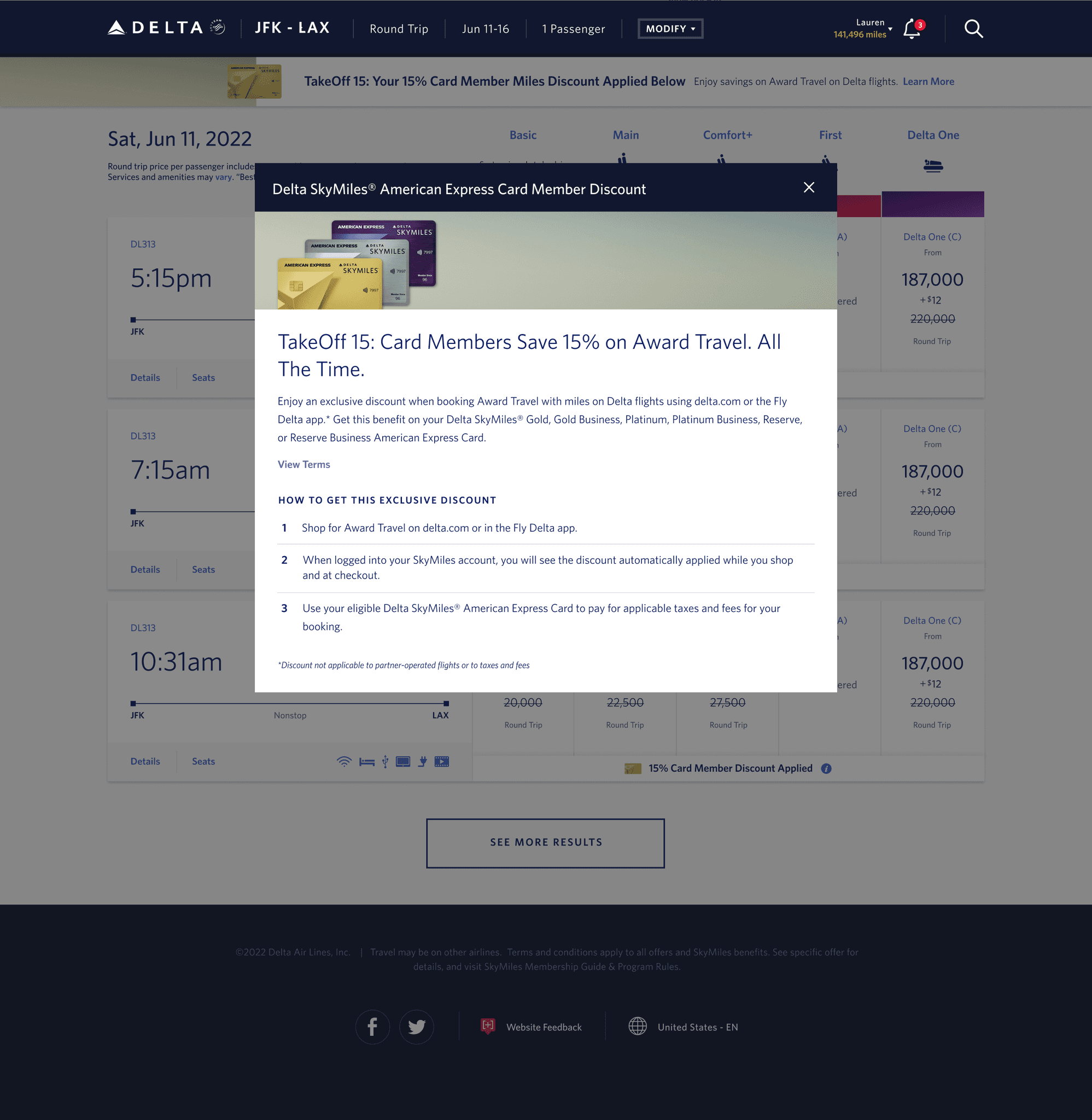
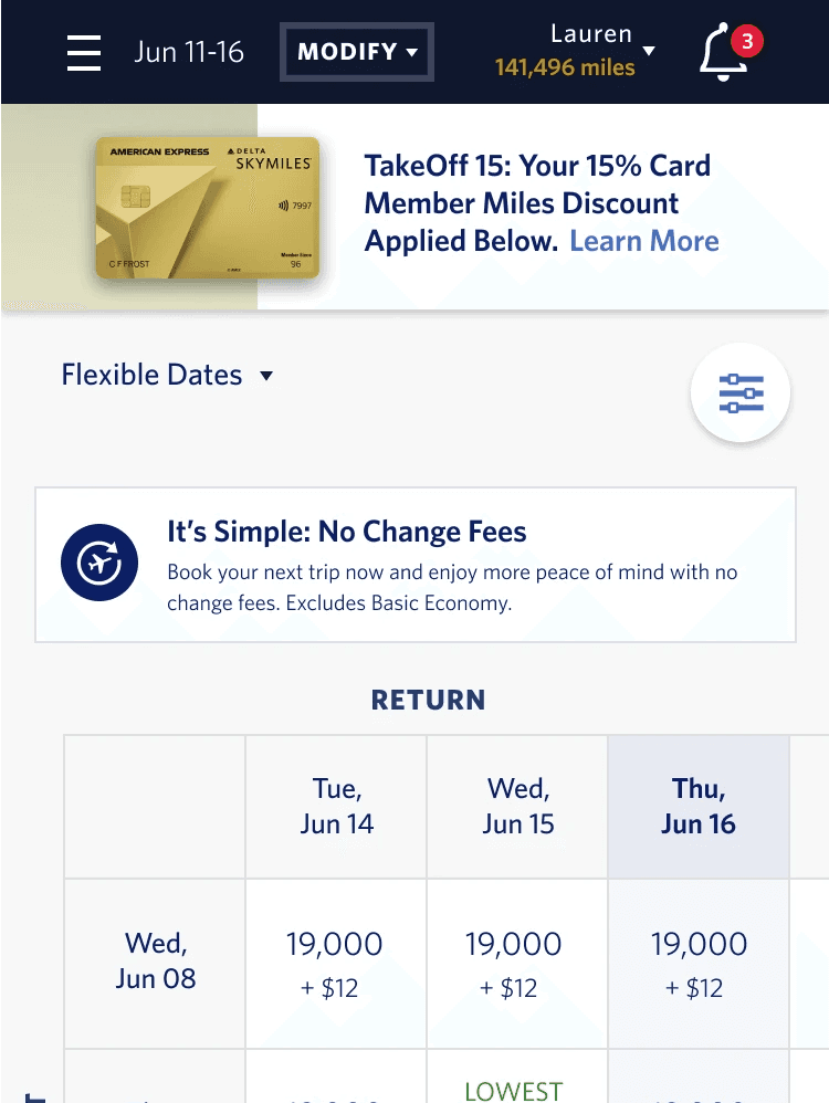
Customized banners/styles for AMEX cards for a personalized experience.
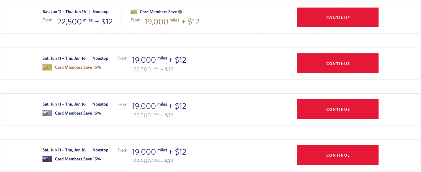
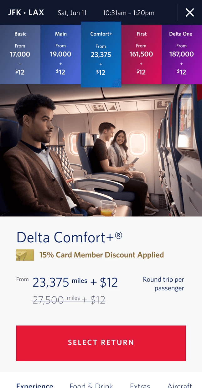
Use strikethrough pricing to display discounts for AMEX card bookings.
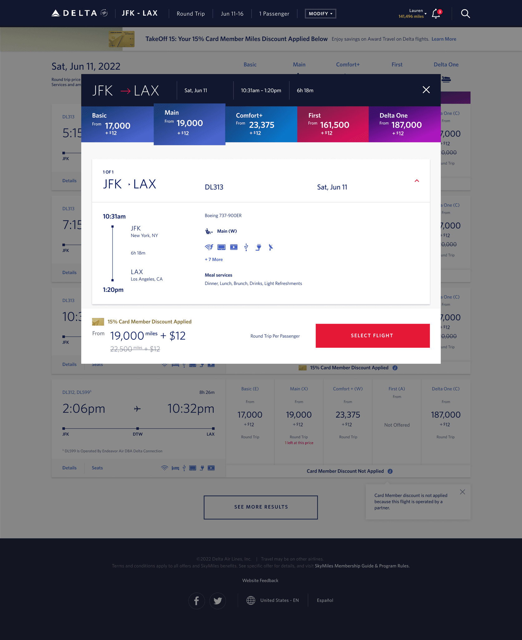
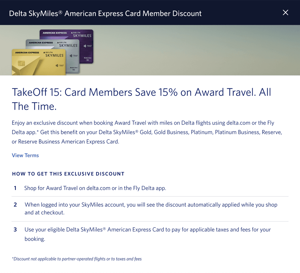
Display modals with terms for transparency and compliance.
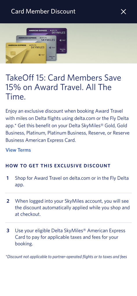
Highlight the benefits that cardholders can earn by signing up for an AMEX card, showcasing the value of the promotion and encouraging card sign-ups.
Process
Discovery
UX and UI Design
Style Guide
Development
Project Details
Project Duration: 6 Months
Team: 1 Scrum Master, 1 TPO, 1 Product Owner, 8 Developers, 2 designer, and 2 QA
My Role: UX/UI Designer
Platforms and Tools
Platform: Responsive web for desktop, tablet, and mobile
Tools: Figma and Version One
Desktop Mock Ups
Discovery
1.1 Comprehending the User
To gain a deeper understanding of the user's needs, I formulated a set of questions aimed at clarifying the desired solution:
Who is the target audience for this promotion?
How will the users be notified about the discounted pricing they receive?
What is the current AMEX card level in the user's Skymiles account?
How can we effectively highlight the value of the promotion and incentivize users to sign up for the card?
1.2 Design Approach

Anchoring Effect
The crossed-out price acts as an anchor, making the current price appear more appealing. This is a result of the anchoring bias, where decisions are influenced by the first piece of information encountered. In user testing, participants consistently found discounted prices more attractive when displayed next to a higher original price, even if they hadn’t planned to buy

Increased Trust in Discounts
Displaying the original price alongside the discount boosts its credibility. Users are more likely to trust they’re getting a real deal when both prices are visible. A/B tests across retail sites have shown that strike-through pricing increases user trust, leading to higher conversion rates for discounted items.

Emotional Influence
The visual design of strike-through pricing can trigger emotional responses. Research on color and font shows users preferred subtle strike-throughs (like light gray) over bold ones. This indicates that while the strike-through is effective for conveying discounts.
1.3 Defining Card Levels
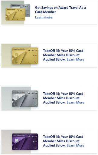
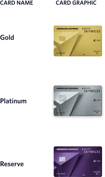
The Delta AMEX card offers three levels: Gold, Platinum, and Reserve. Users must have the respective card in their payment information to avail discounts while shopping with miles. To ensure future-proof design, we create customized experiences and components, enabling specific promotions based on card level.
Design
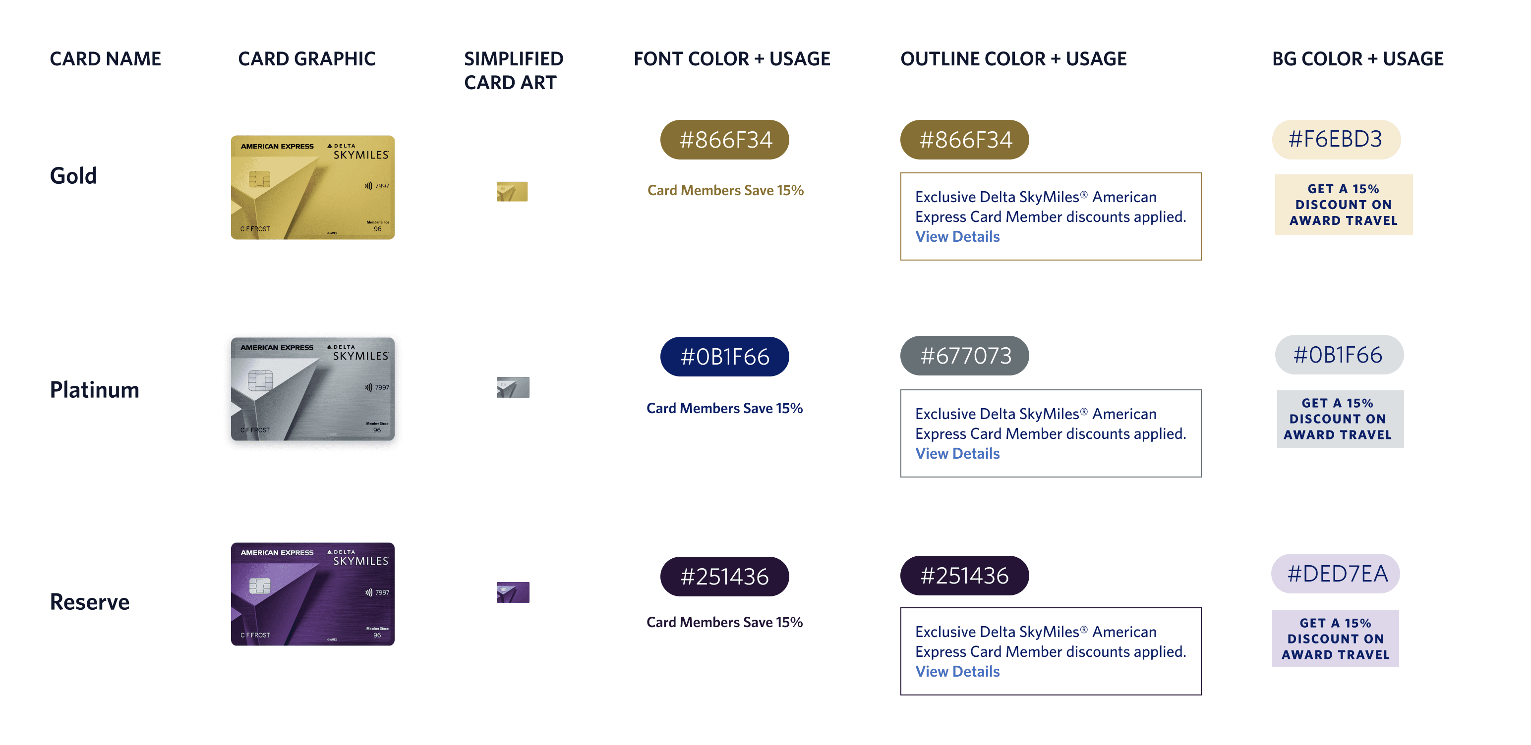
2.1 Developing the AMEX Promotion Style Guide
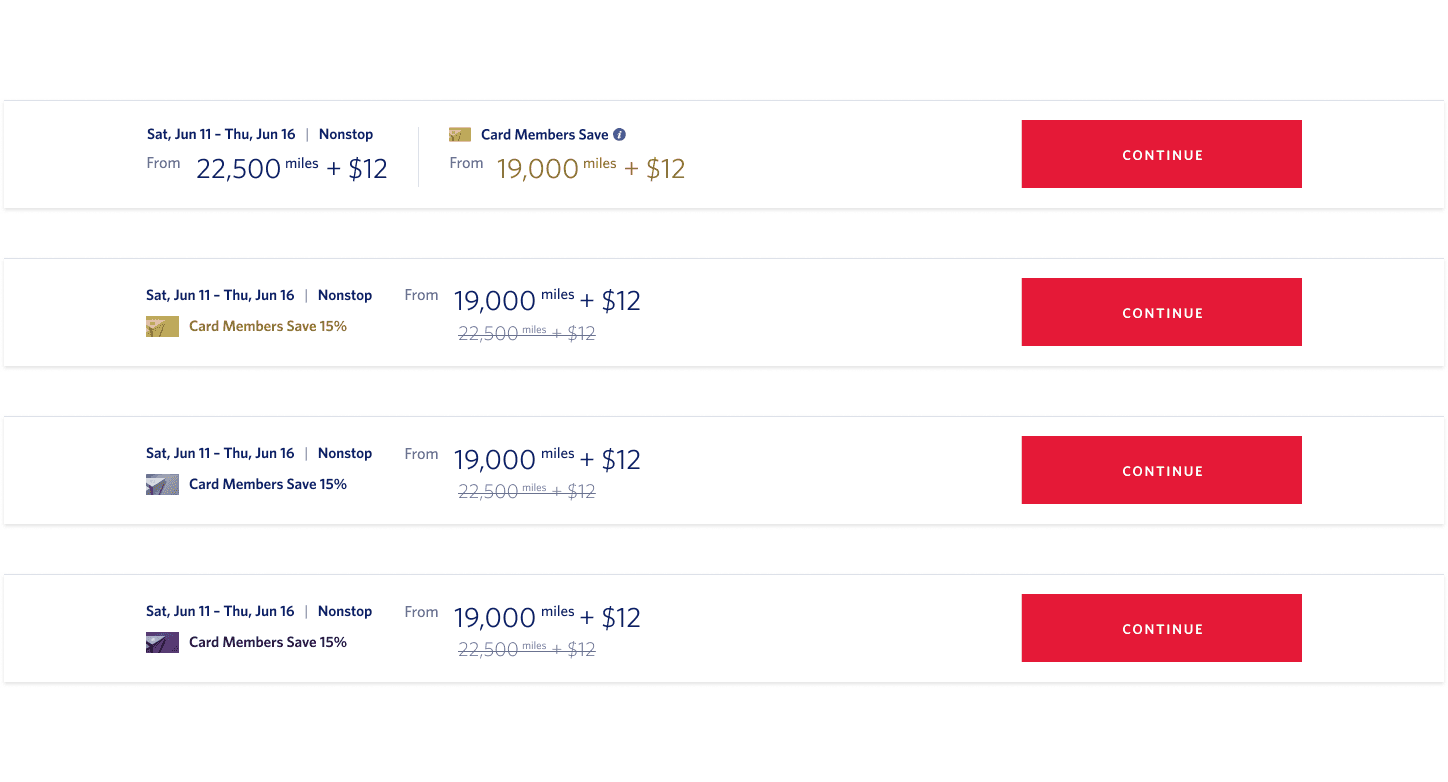
To ensure consistency and cohesiveness in promoting the different card levels, I crafted a comprehensive style guide. This guide encompasses a range of design elements, including card icons, font colors, outline colors, and background colors, tailored to each card level. This serves as a valuable reference framework for developers as they work on creating promotional materials.
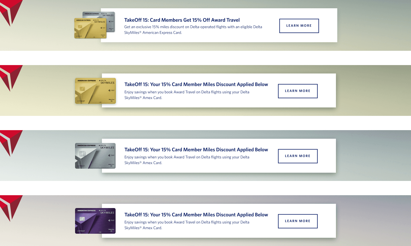
2.2 Customized Header Banners
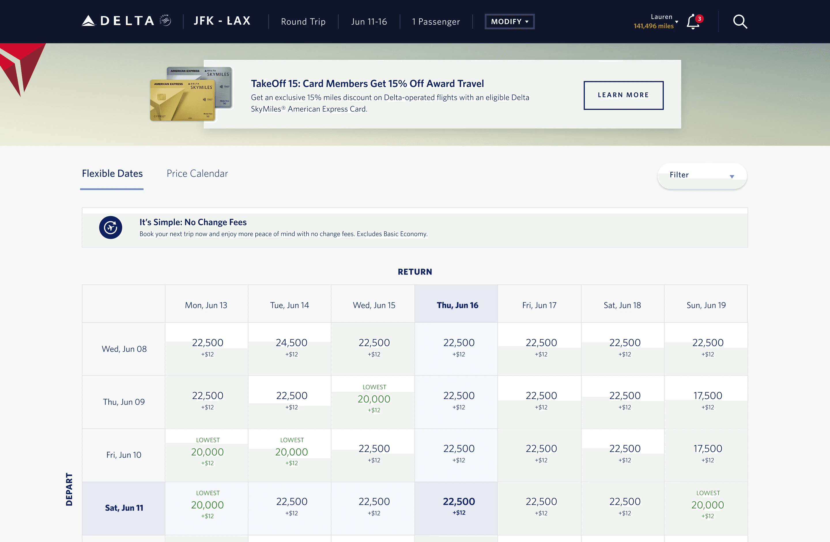
For Non-Card Members: I designed banners that highlight the potential savings they could enjoy by signing up, accompanied by a compelling call-to-action (CTA) button to learn more. These banners feature the gold and silver card tiers as research shows these are the majority of our users who are members.
For Card Members: To enhance the experience for cardholders, I designed distinct header colors that clearly communicate the automatic discounts they receive, tailored to their specific card tier. The banners also incorporate a CTA button to easily explore the details of eligible flights, adding convenience and value for card members.
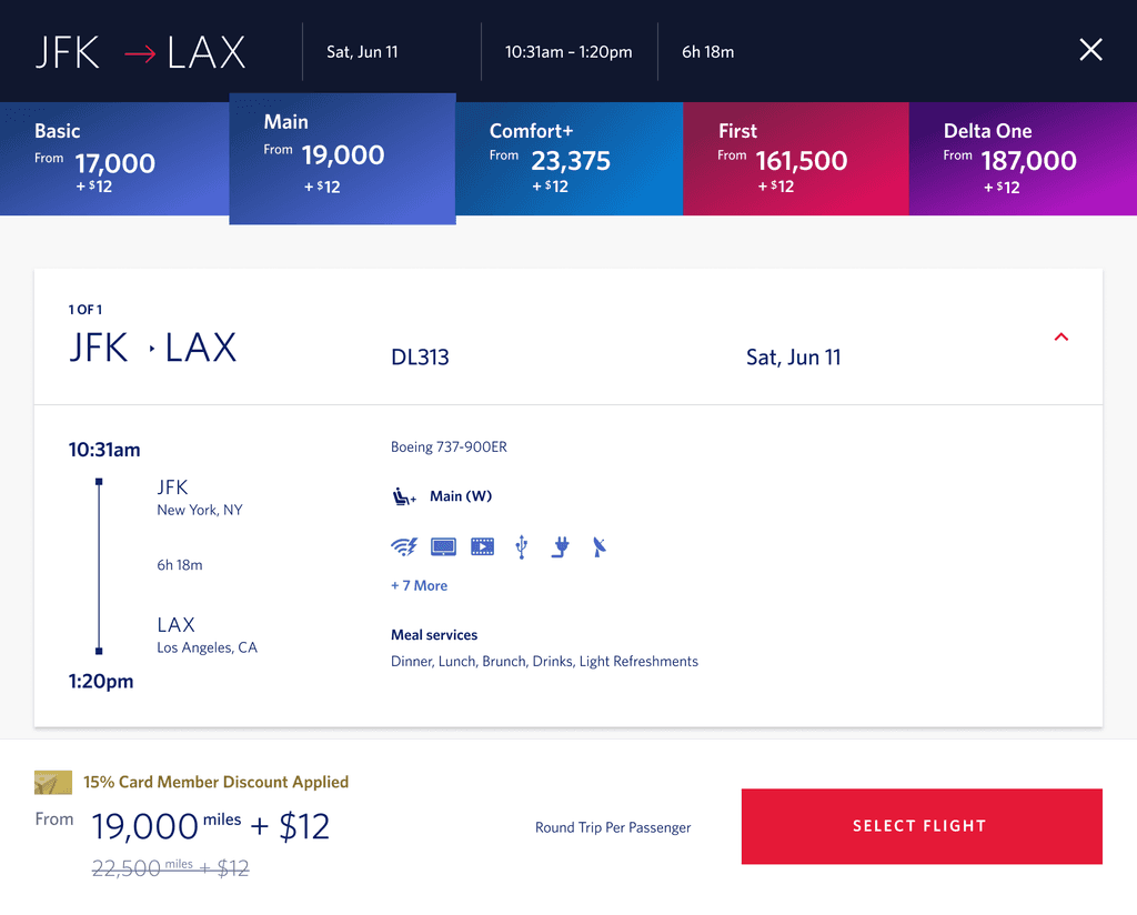
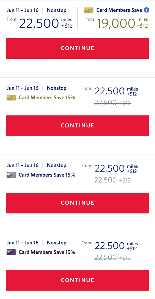
2.3 Personalized Footer Options
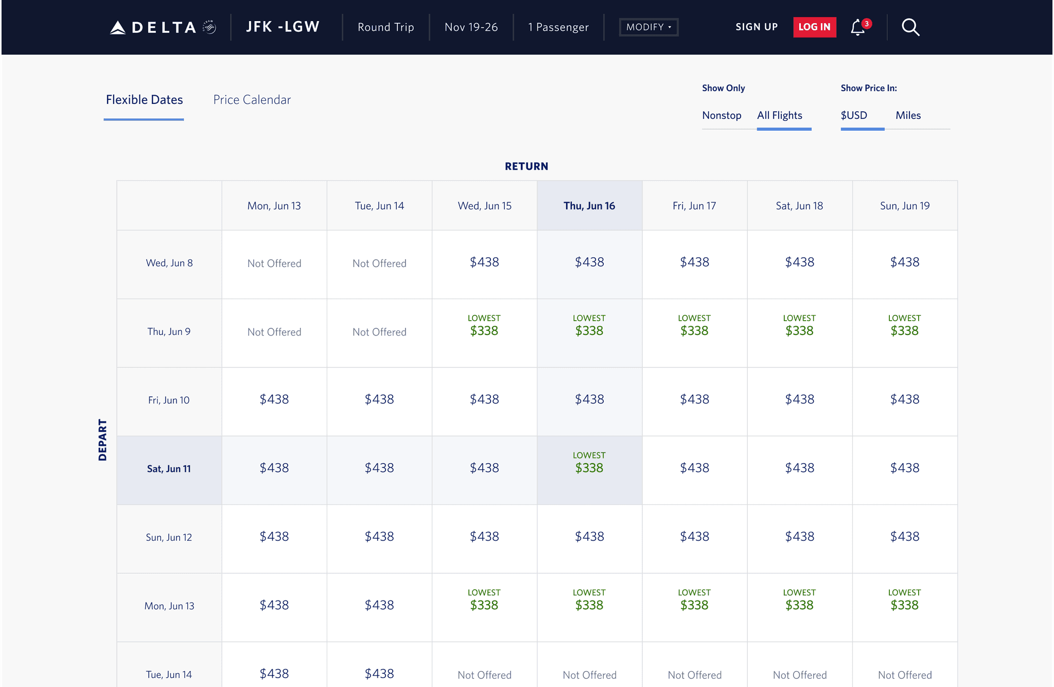
For Non-Card Members: When a user selects a flight on the Flexible Dates page, they will be able to see the future reduced number of miles they would use if they were an AMEX Card member. This price will be updated in real-time based on the user's selection.
For Card Members: We introduced a strikethrough pricing feature that shows the original fare the user would have paid if they were not AMEX Card members as well as a message that their discount has been applied. This allows Card members to see the discounted fare they are eligible for, ensuring transparency and confidence in their selection.
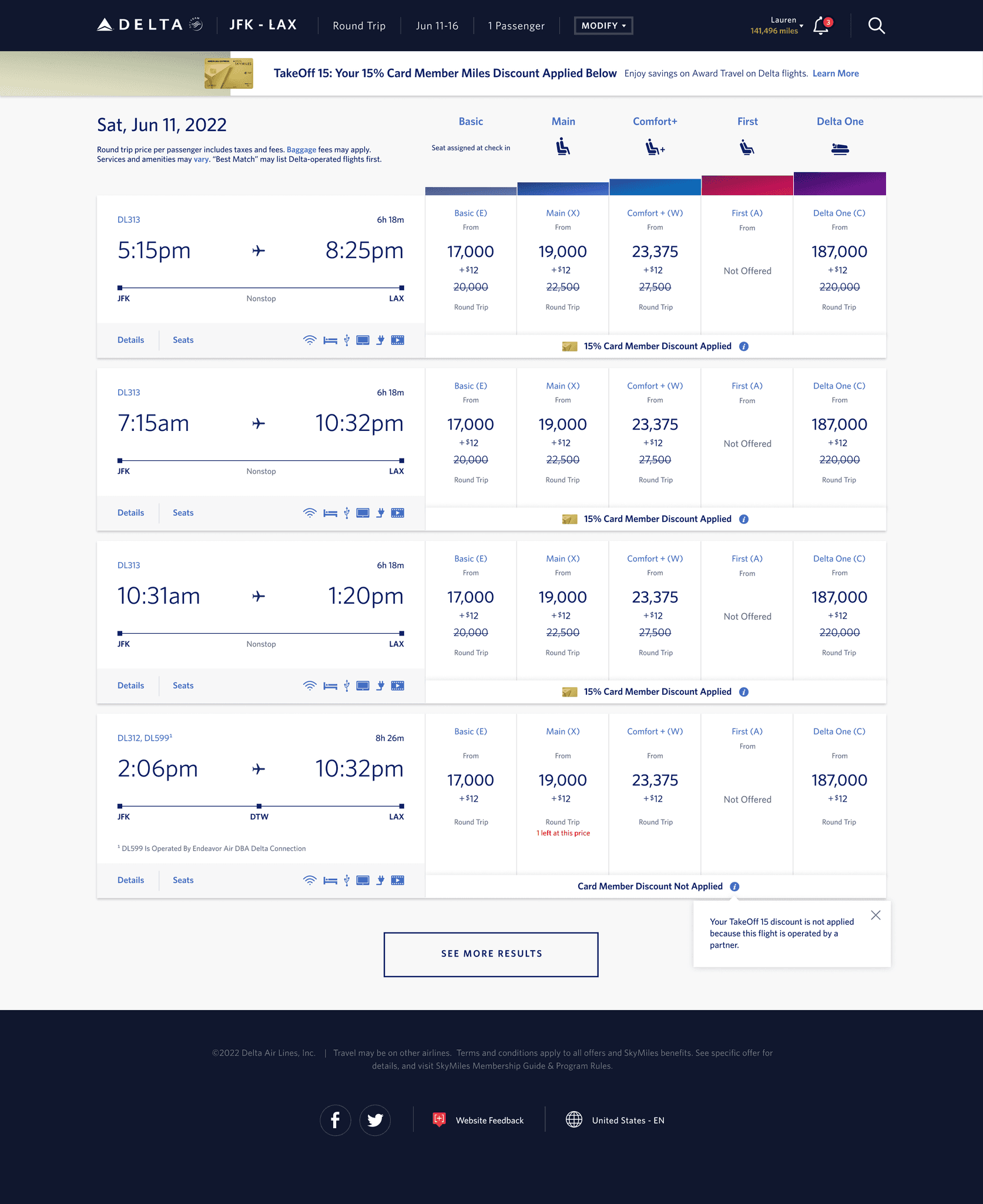
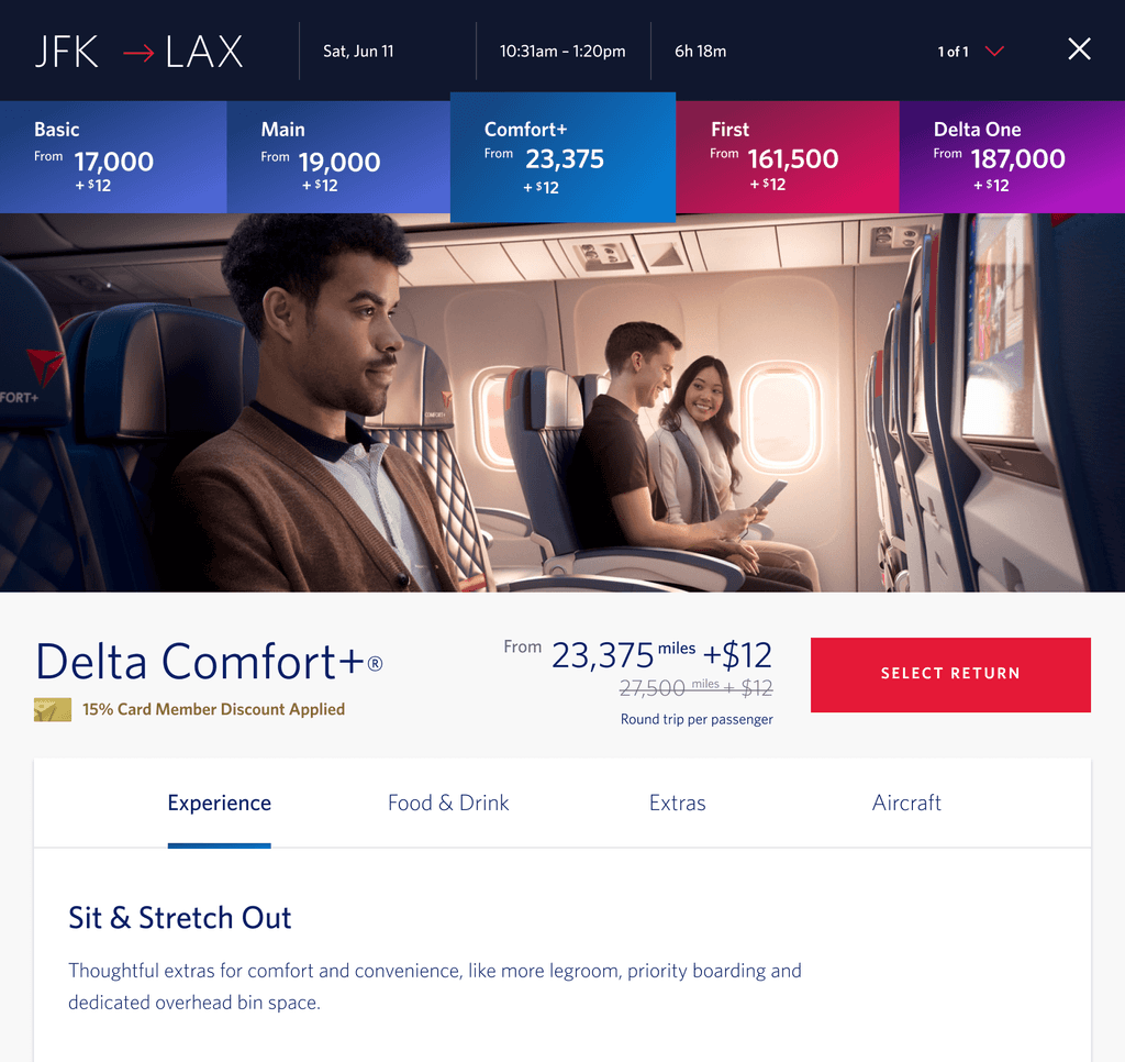
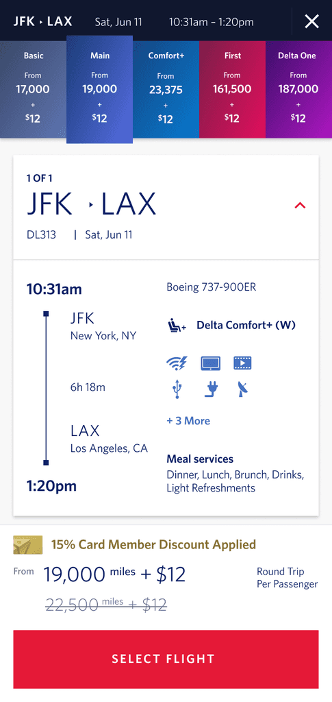
2.4 Enhanced Farecell Design
Non-Card Members: Similar to the footer, we will display the potential savings for users when choosing different cabins, making it clear the discounts they could receive.
Card Members: We incorporated the same strikethrough pricing as in the footer, along with a prominent message confirming that their exclusive AMEX Card member discount has been applied, ensuring transparency and peace of mind. This messaging could also included that a discount was not applied depending on the type of fare.
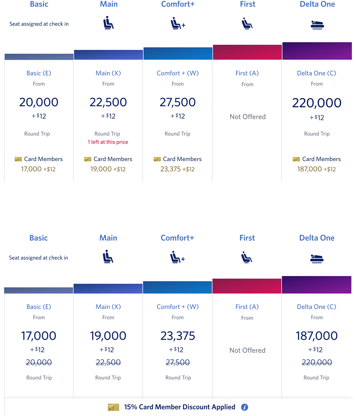
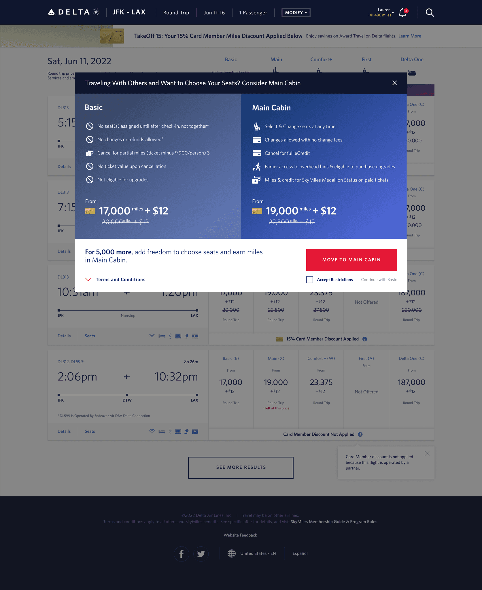
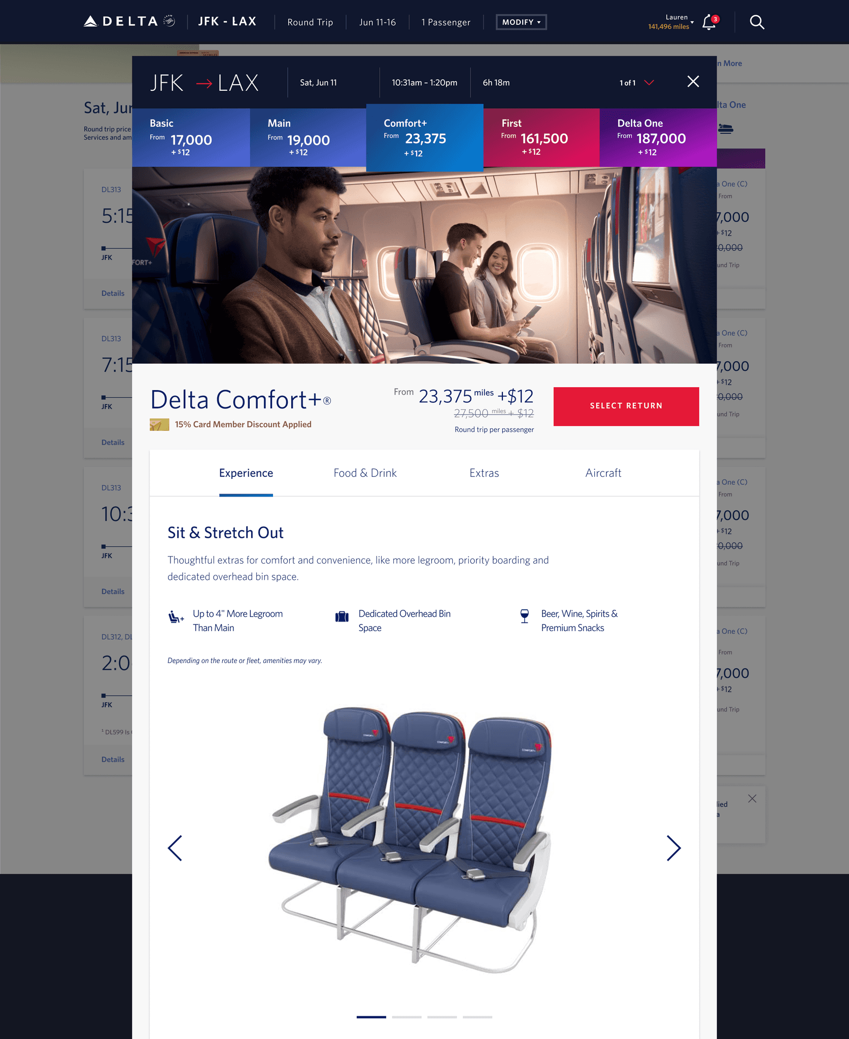
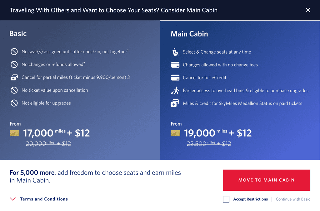
2.5 Enhanced Price Design in Modals
In order to meet the legal requirements set by the business team for discounted pricing, we have incorporated the design elements of strikethrough pricing, potential savings, and messaging into the modals where users can explore different cabin options. This ensures that users are informed about the discounts available to them while adhering to legal guidelines, providing a seamless and transparent shopping experience.
2.6 Transforming AMEX Promotion to Mobile Design
Incorporate responsive design principles to ensure that the enhanced price design elements, such as strikethrough pricing, potential savings, and messaging, are displayed properly on mobile screens.
Optimize the layout and spacing of the modals to fit smaller mobile screens, while maintaining the clarity and readability of the pricing information.
Use concise and clear messaging to convey the discounts available to non-card members and card members, taking into consideration the limited space available on mobile screens.
Test the mobile designs extensively on different devices and screen sizes to ensure a consistent and user-friendly experience across various mobile platforms.
Consider the mobile user's context and behavior, such as limited screen real estate, touch interactions, and on-the-go browsing, when adapting the price designs to mobile, to ensure a seamless and convenient experience for mobile users.
Development
3.1 Developer Handoff
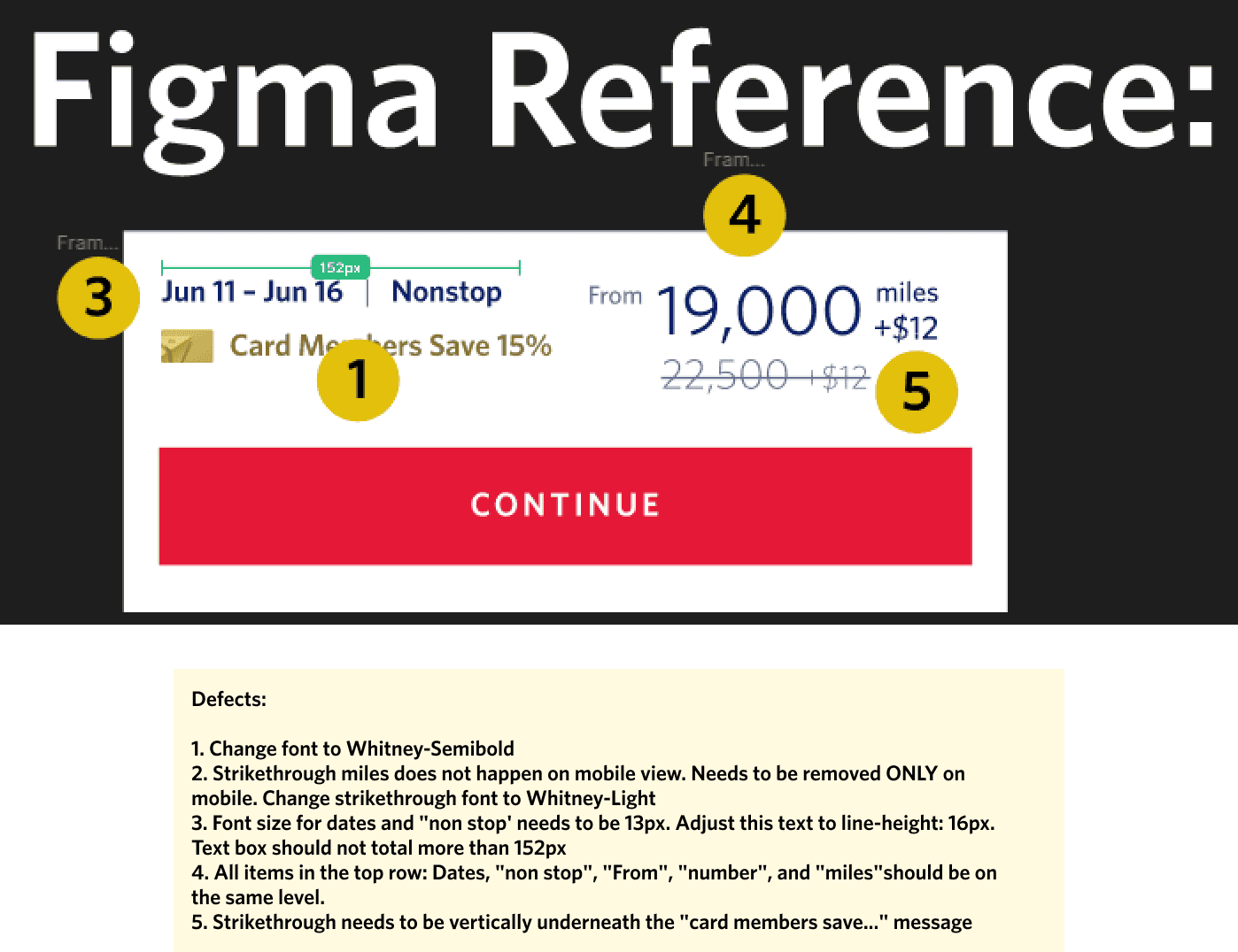
Once my design proved to be successful, I began to annotate the notes needed for the developers. The team made sure that all the behaviors in the design were described as how they should react on the website. Sizes for text and spacing were also added to the designs so that developers have an accurate reference of sizes.
3.2 Testing for Optimal UX/UI Development
Through the development phase, I collaborated with developers and QA to conduct thorough testing of HTML and CSS code to ensure accurate and defect-free development of the UX/UI for optimal user experience.
Tested HTML and CSS code across different web browsers, devices, and screen sizes
Checked compliance with W3C web standards, including proper markup, semantic structure, and accessibility considerations
Performed cross-browser testing to ensure consistent display and functionality of the promotion across popular web browsers such as Chrome, Firefox, Safari, and Edge
Checked for proper handling of edge cases, such as long text truncation, overflow handling, and responsive behavior when the screen size changes dynamically
Reflection
4.1 Reflecting on the Project
This project posed a unique challenge of creating personalized experiences for diverse users. This resulted in many possible variations in card images, banners, footers, font colors, and sizing, due to the business requirement of making each card tier level unique. Additionally, incorporating legal requirements for pricing throughout the design proved to be challenging. Finally, meticulous testing was necessary to ensure seamless UX/UI components across various card tier scenarios and responsive web design for different screen sizes.
4.2 Looking Ahead
Looking ahead, the lessons learned from overcoming the challenges of creating personalized experiences for diverse users, implementing unique design elements for different card tiers, and navigating legal requirements will inform and shape future design endeavors. The experience gained from meticulous testing and consideration of various scenarios will contribute to more efficient and effective design approaches in upcoming projects, aiding in building robust and user-friendly interfaces in the ever-evolving landscape of user experience and user interface design.
