Online Store Redesign to improve experience for customers.
Landing Page
Responsive Web
Motion Design

About Theneo
Theneo is a tool that helps developers and project team members generate API documentation. This API documentation tool is designed for entire teams, from developers to non-technical team members. They contacted our design team because their landing page did not align with their internal platform. Clean API documentation is key for a great developer experience.
Problem
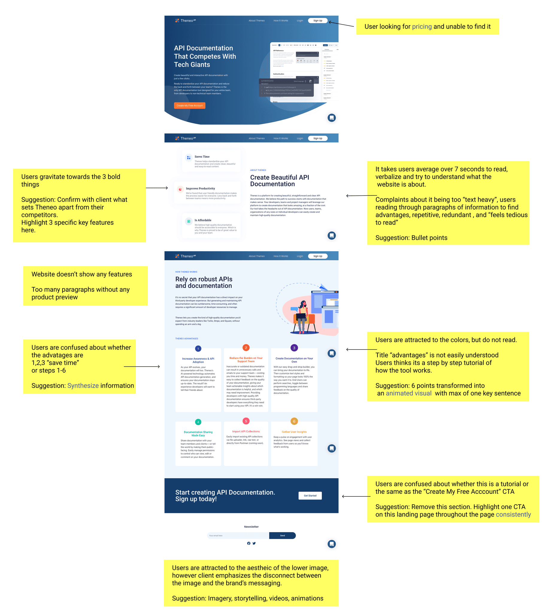
Users cannot immediately tell what the website is about or the product that is being sold.
Although images are pleasing, they don't correlate with the product and don't engage targets users.
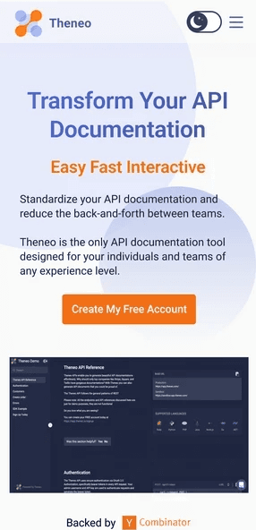
Theneo's current landing page does not resonate, nor clearly describe how their tool solves the developer’s problem by simplifying API documentation
Solution
Break down the context so that it tells a story and add animations throughout the page so that it grabs users' attention.
Clearly describe how their tool solves the developer’s problem by simplifying API documentation.
Process
Discovery
Ideation
Wireframing
Hi-fidelity
Prototype
Developer handoff
Project Details
Project Duration: 2 Months
UX/UI Designer in a team of 5
Platforms and Tools
Platform: Responsive web for desktop, tablet, and mobile
Tools: User Testing, Figma, and Jira
Discovery
1.1 User Testing Questions
Users were asked the following question when they browsed through Theneo’s current landing page:
Do you understand what this website is about?
Are you overwhelmed with the amount of information displayed?
Does this website grab your attention?
Is this page easy to navigate?
1.2 Research and User testing Insights
Key insighst:
Users can’t quickly understand what the product is about.
Help users focus their attention on the product’s advantages and main CTA.
Straightforward navigation and take users on a journey to appreciate Theneo’s story.
UX Design
2.1 Low Fidelity Wireframes
As a team, we tackled the lo-fi screens collaboratively. Each team member was tasked with creating two sections of the final screens and then merged our sections into one.
Each team member designed a lo-fi prototype in order to come up with several iterations. We met up to discuss and ideate before presenting the final ideas to the client.
2.2 Pricing Page Design
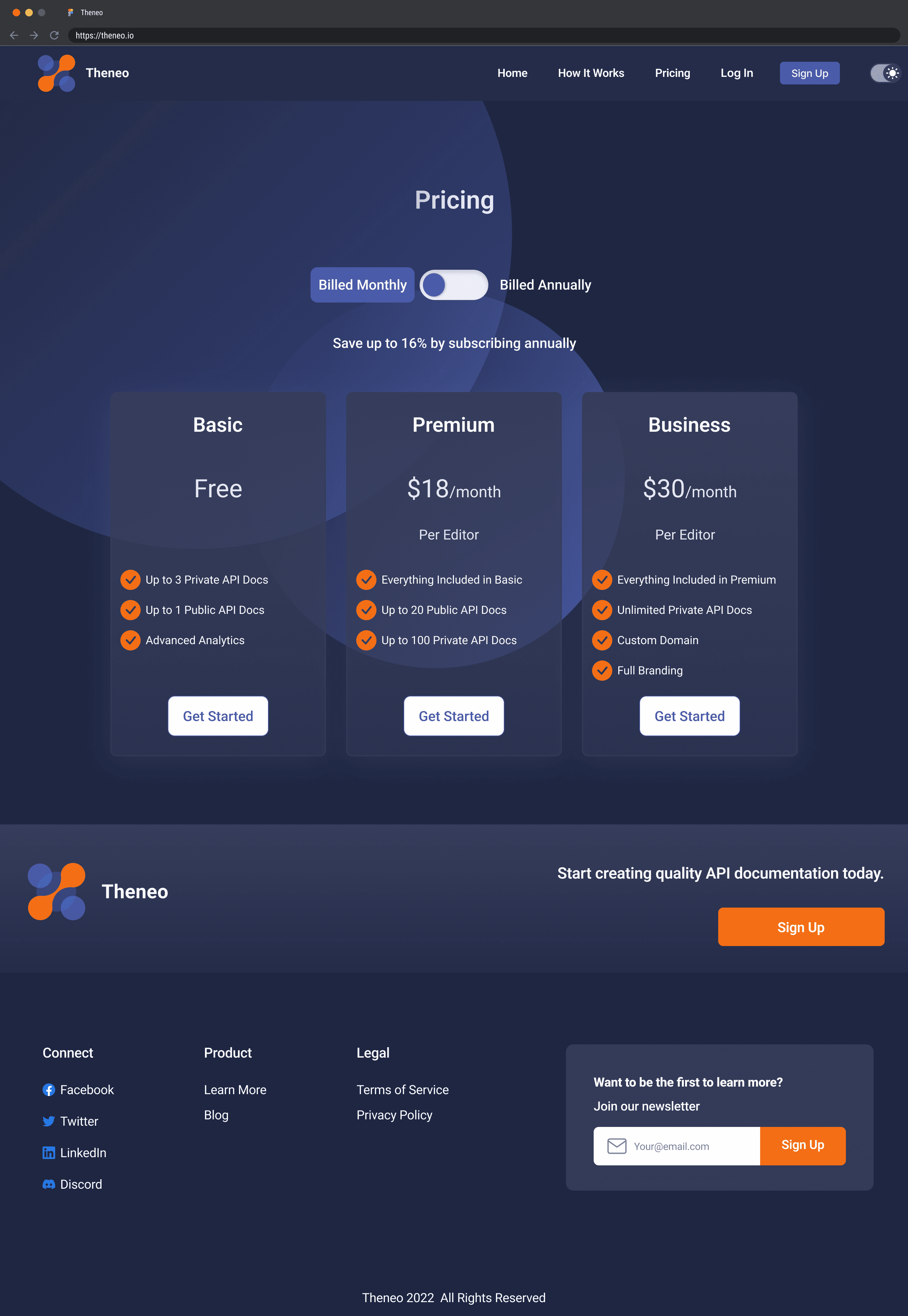
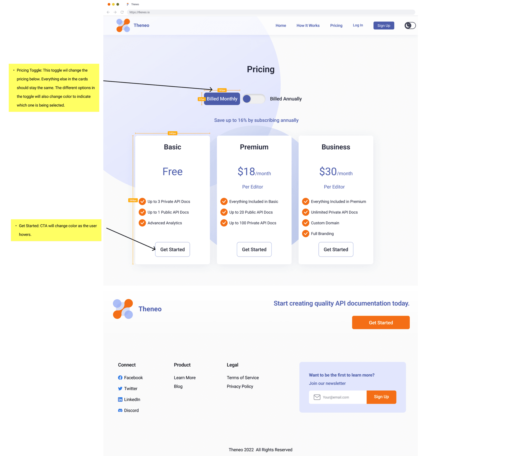
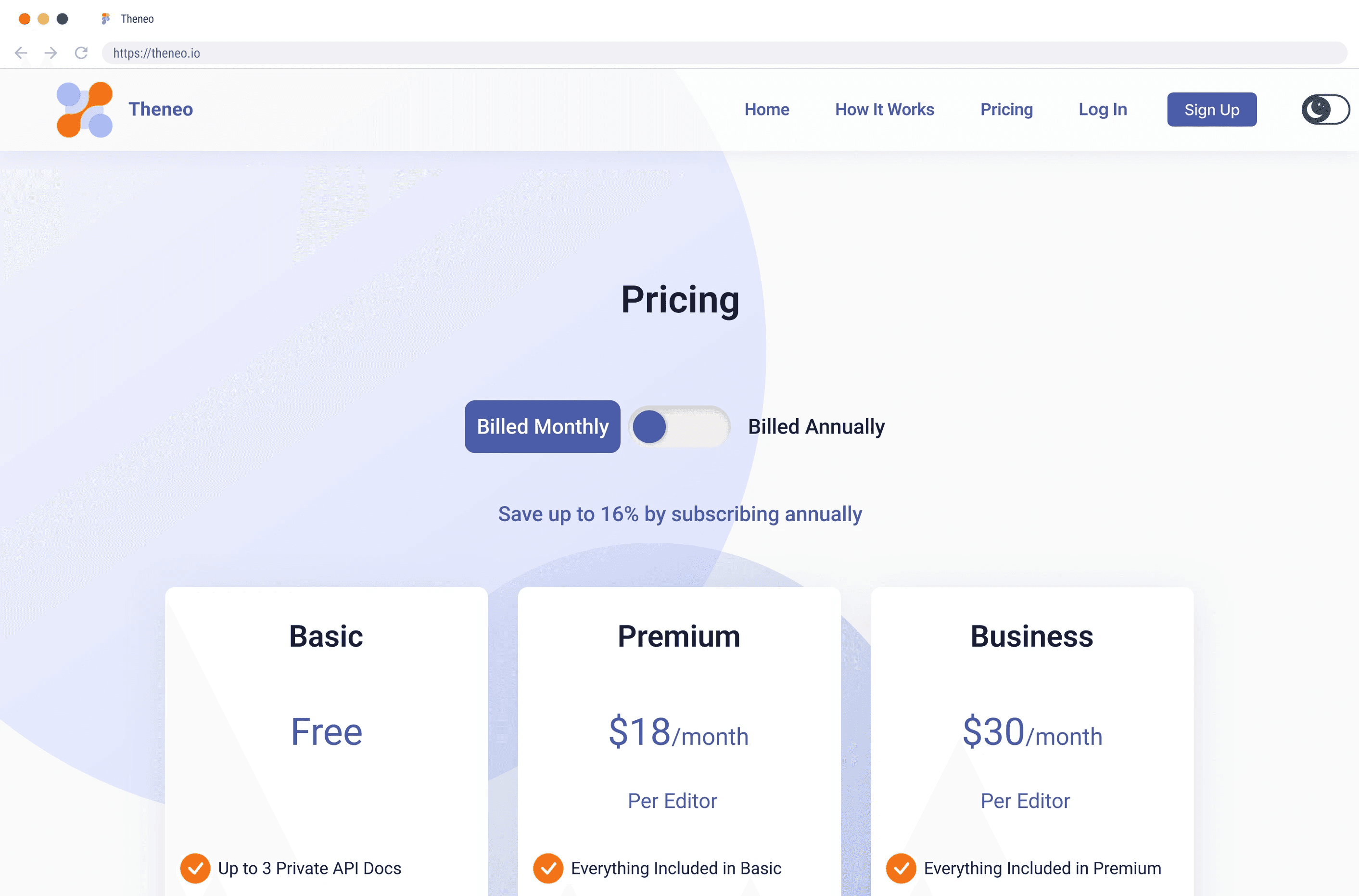
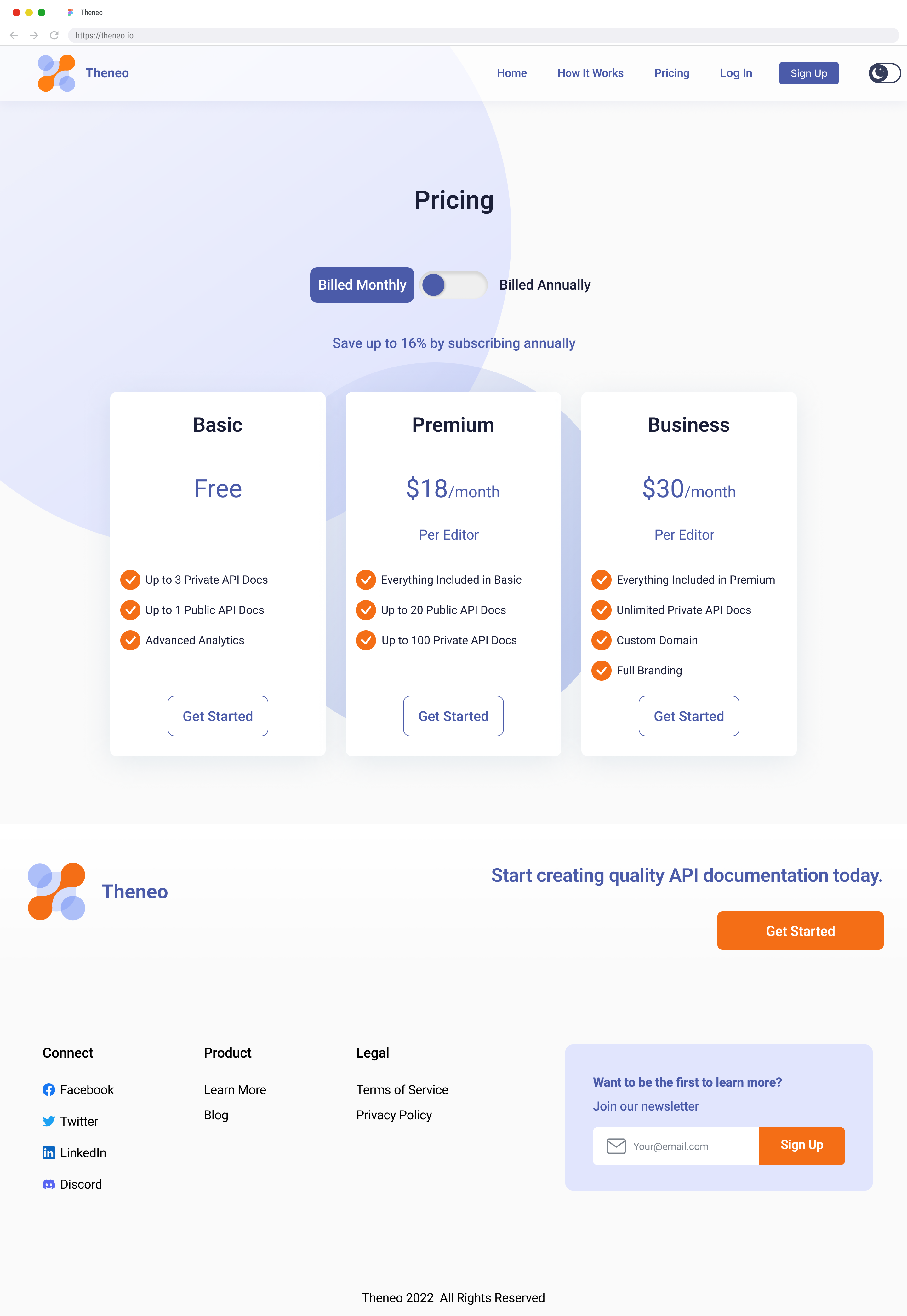
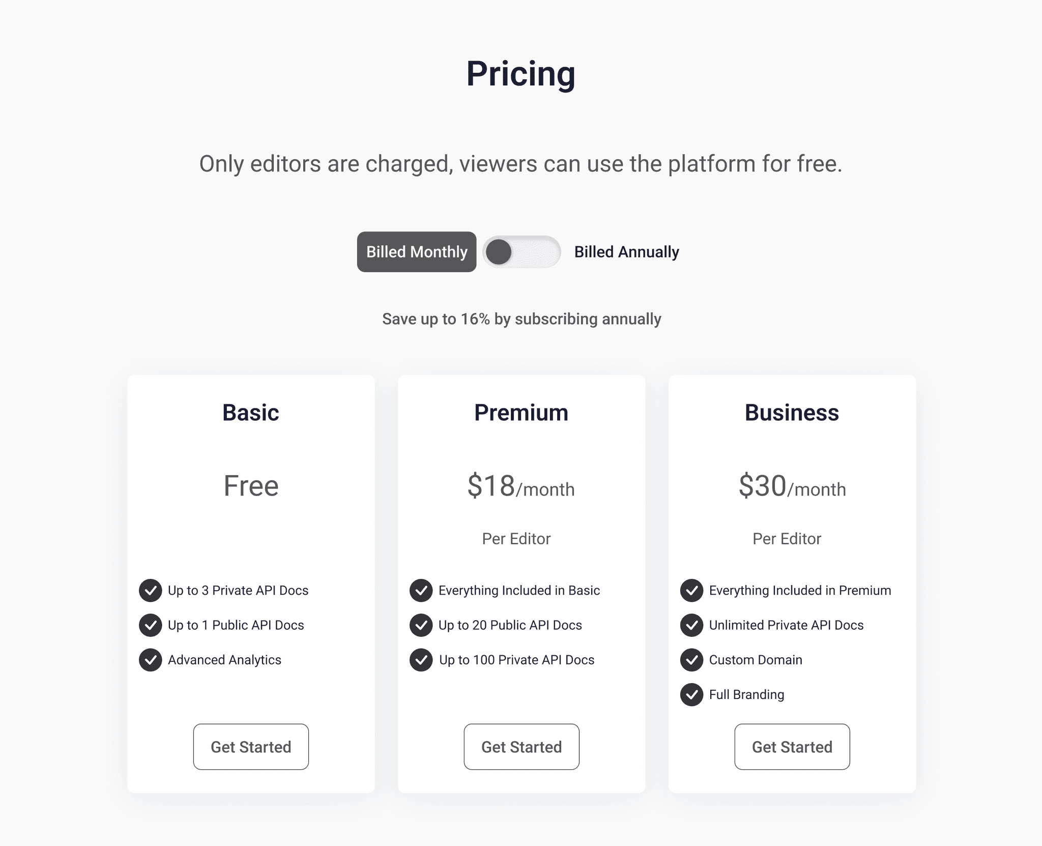
My part of the UX design was to design the pricing page. On the previous website, Theneo did not have a pricing page, so I came up with a design that clearly stated the information the user needed to purchase a plan.
Decision:
Let users know the different plan options available on the platform
Offer the users the ability to be billed monthly or annually
Inform users of the prices of the different plans
State the features available in each plan
Clear CTA to choose the different plans

2.4 Transforming Pricing Page Design to Mobile
In order to integrate the pricing page into a mobile platform, some design changes had to be made. Ultimately, the goal was to keep as much of it the same as the desktop version.
Decisions:
Provide the same information from desktop
Keep card sizing consistent from desktop to mobile
Stack cards in a vertical orientation
Interaction between monthly or yearly billing consistency
CTA with the same styles
UI Design
3.1 Style Guide
After the lo-fi prototype was approved, our team began designing the style guide and interactive Hi-Fi prototype.
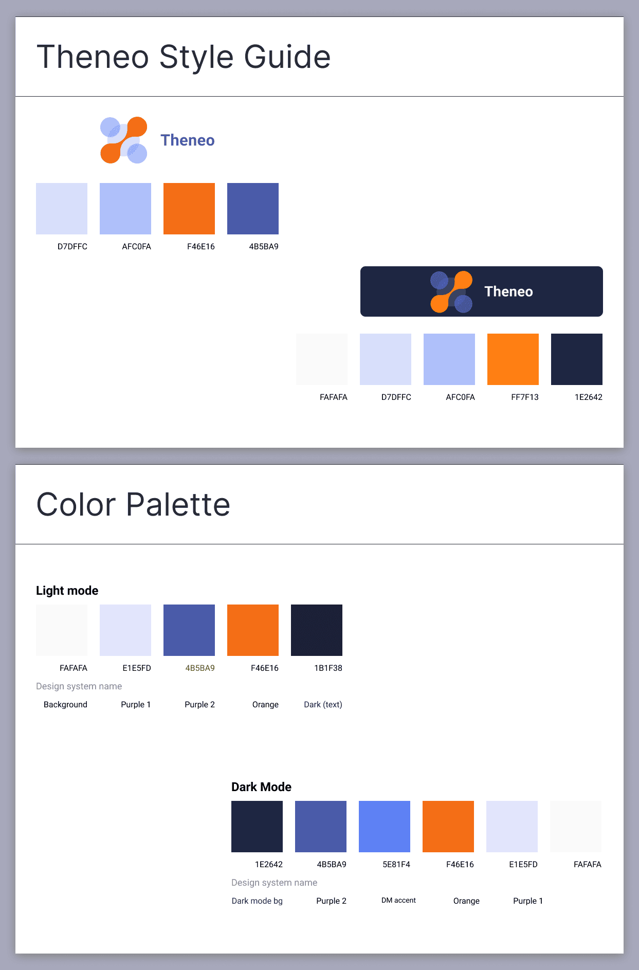
This style guide is based on Theneo's brand colors.
Make sure the style guide is consistent with the already established brand identity.
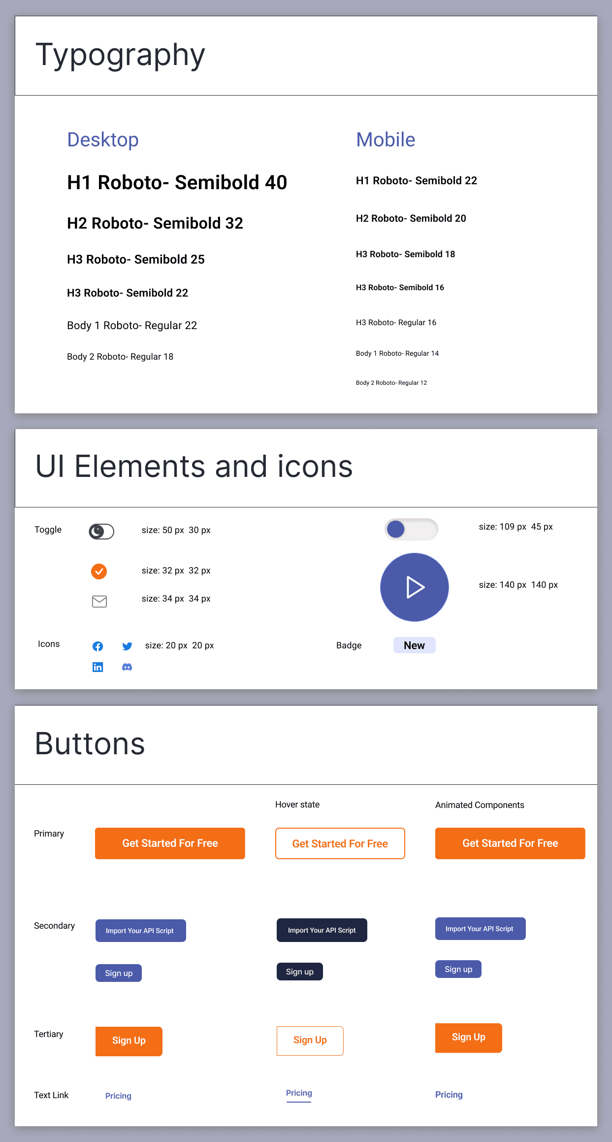
Font decisions were made in mind for desktop and mobile platforms.
Colors needed to be compatible with light and dark mode versions of the website.
Organizing and using the master styles on Figma to have consistency.
Within Figma, we updated the design system to ensure color consistency throughout the desktop and mobile Hi-fi mockups.
3.2 High Fidelity Wireframes
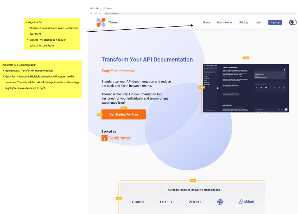
With the style guide set, the team started working on designing the final UI for the screens. We used the orange color sparingly to make sure that it wasn't too harsh for the users. We also decided to use blue for the main CTA actions and majors descriptions.
Ensure there was enough contrast between the background color and cards
Use the different colors to provide bullet points and CTA buttons
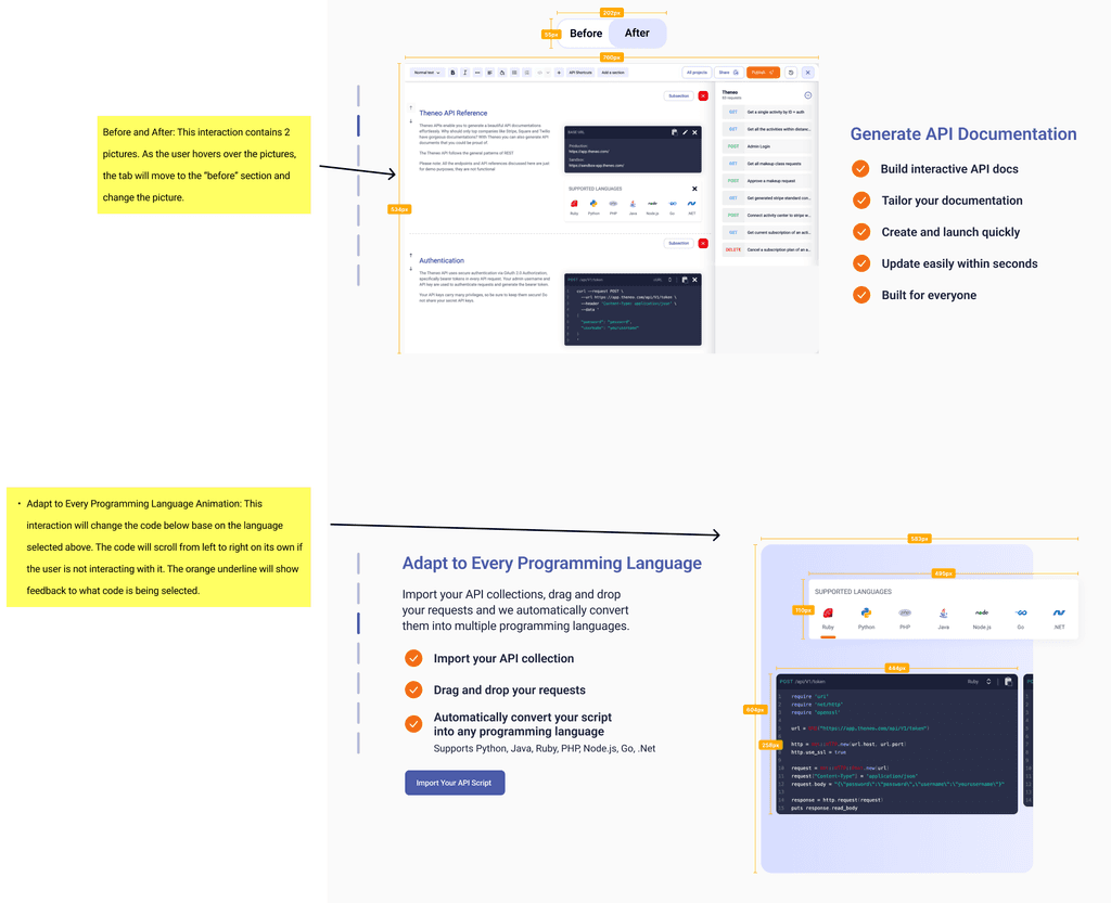
Hover color changes in order to provide user decision feedback
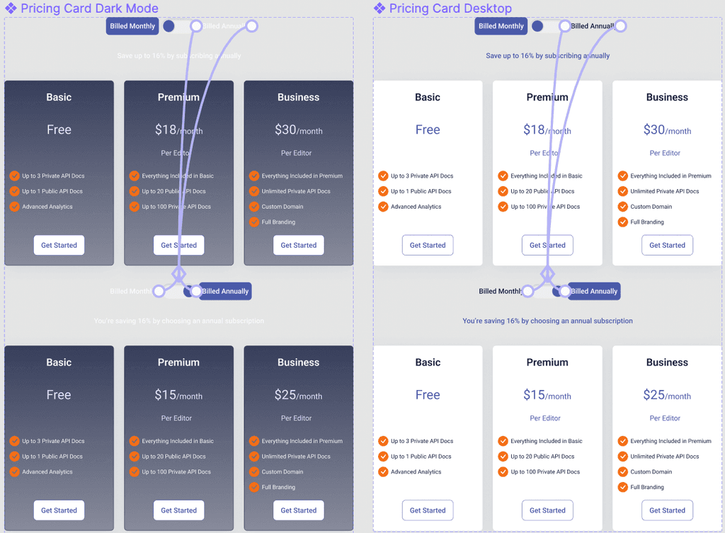
Design separate colors for compatibility within light and dark mode versions of the website.
3.3 Interactive Pricing Animation
After designing the pricing page, I prototyped the pricing page to change according to the users billing choices. Users are able to click through the different billing modes, and the price will adjust. When this change is made, the user is also notified of the percentage they are saving or could be saving by choosing annual billing
3.4 Animated Home Page Background
We needed a subtle animation to the top of the landing page without it being too distracting. I developed a prototype for some floating bubbles which resemble the Theneo logo to float in the background. I prototyped it to make sure the animation was smooth and slow to not be distracting. The animation was also made to stop after certain amount of repeats.
Prototype
4.1 Prototype
Using Figma we developed a prototype for the client. I made sure to clean up any small spacing, color, misspellings, functionality, and user error.
4.2 Developer Handoff
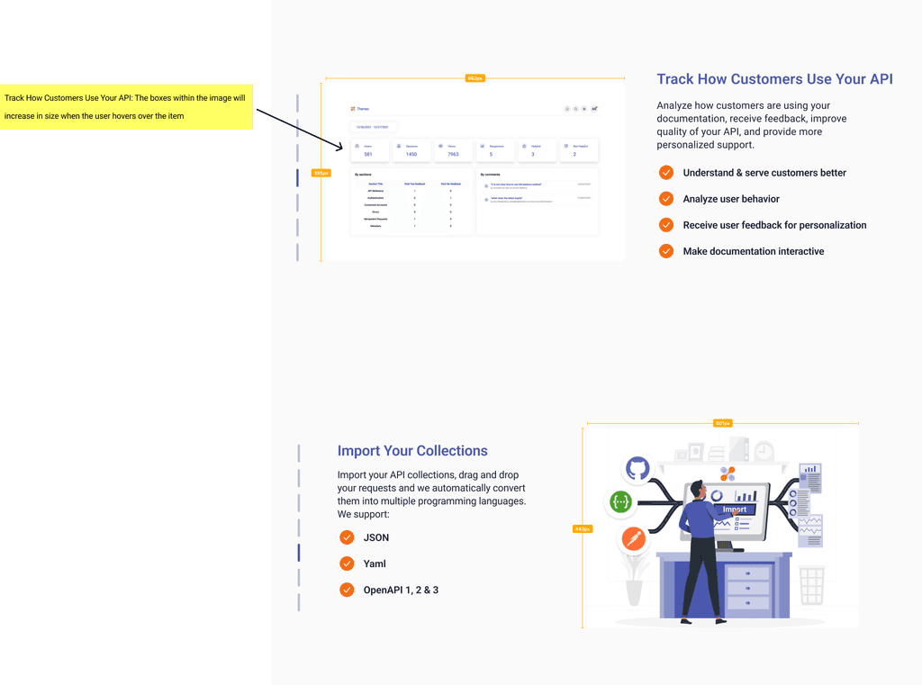
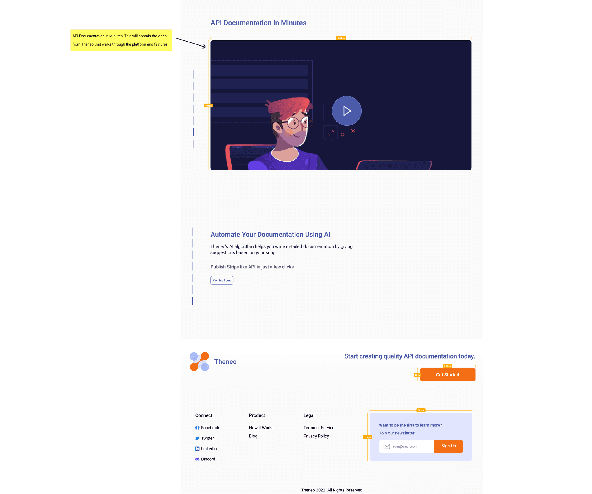
Once our design proved to be successful, we began to annotate the notes needed for the developers. The team made sure that all the interactions in the design were described as how they should react on the website. Sizes for pictures and spacing were also added to the designs so that developers have an accurate reference of sizes.
Reflection
5.1 Looking Back
I learned a lot from redesigning the Theneo website. I am happy that the final product came out as intended. This project included a lot of animation and interaction which required meticulous attention to detail in order to make sure it all worked properly. Working with a team made it easier to share ideas with each other and be able to make the best decision for the user and the company.
5.2 Looking Ahead
In future projects, I will take skills and problem-solving skills and apply them to other challenges in the future. Each different challenge a user faces can result in many different solutions, and the best way to reach that solution is through thorough research, collaborating on ideas, and refining iterations. With this mindset and process in mind, the user will be the end beneficiary of the work done by us the designer, and promote a better experience and business growth.
"Thank you for such amazing work, we really like the updated version. You guys have done an amazing job!"
Ana Robakidze, Founder of Theneo
