Optimization
Responsive Web
Motion Design
About Delta Airlines Shop for a Flight
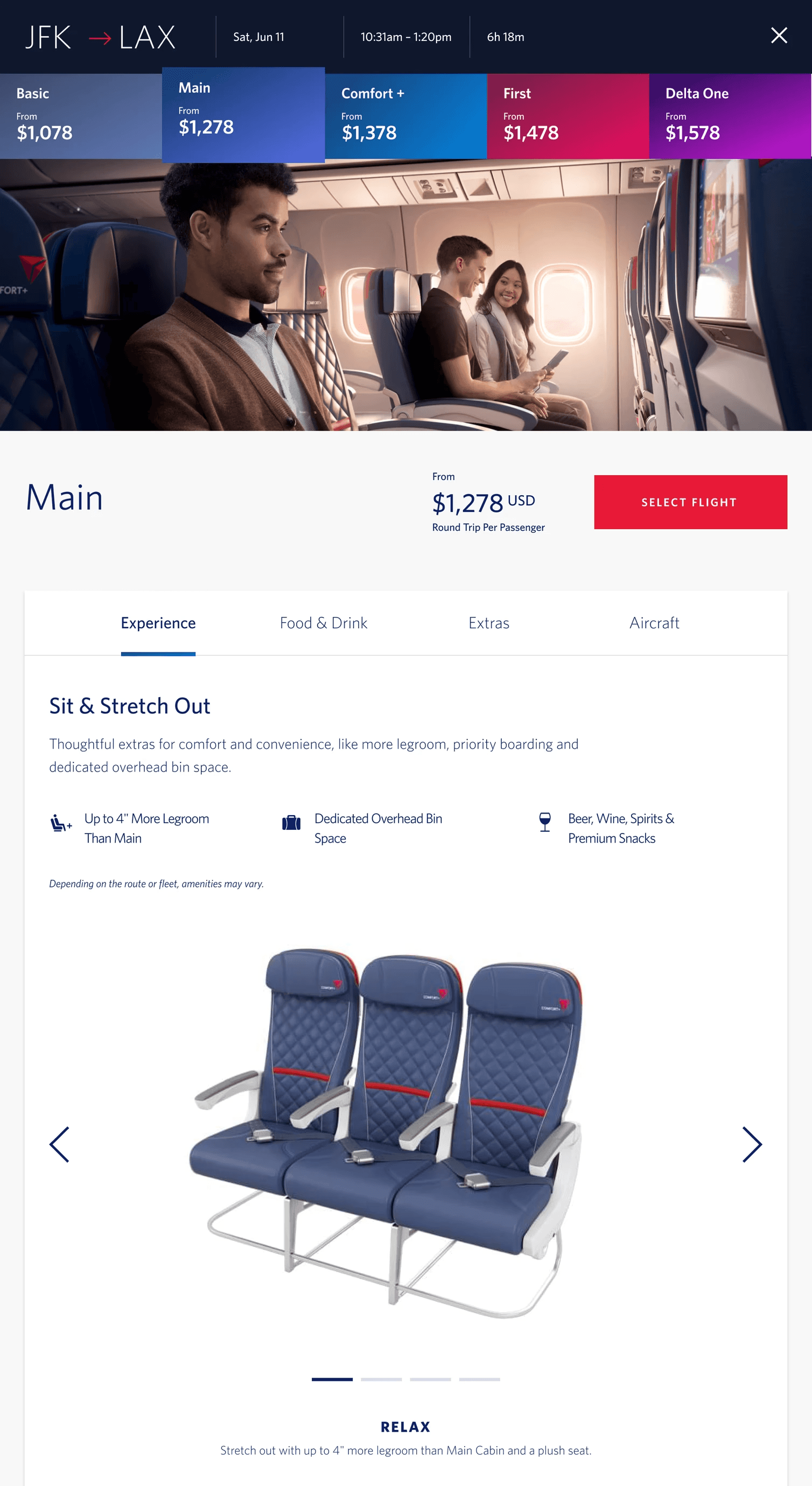
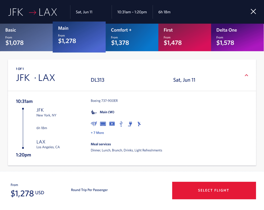
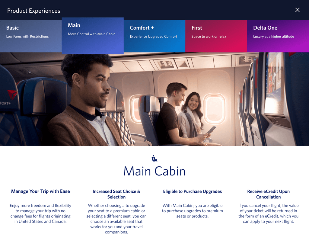
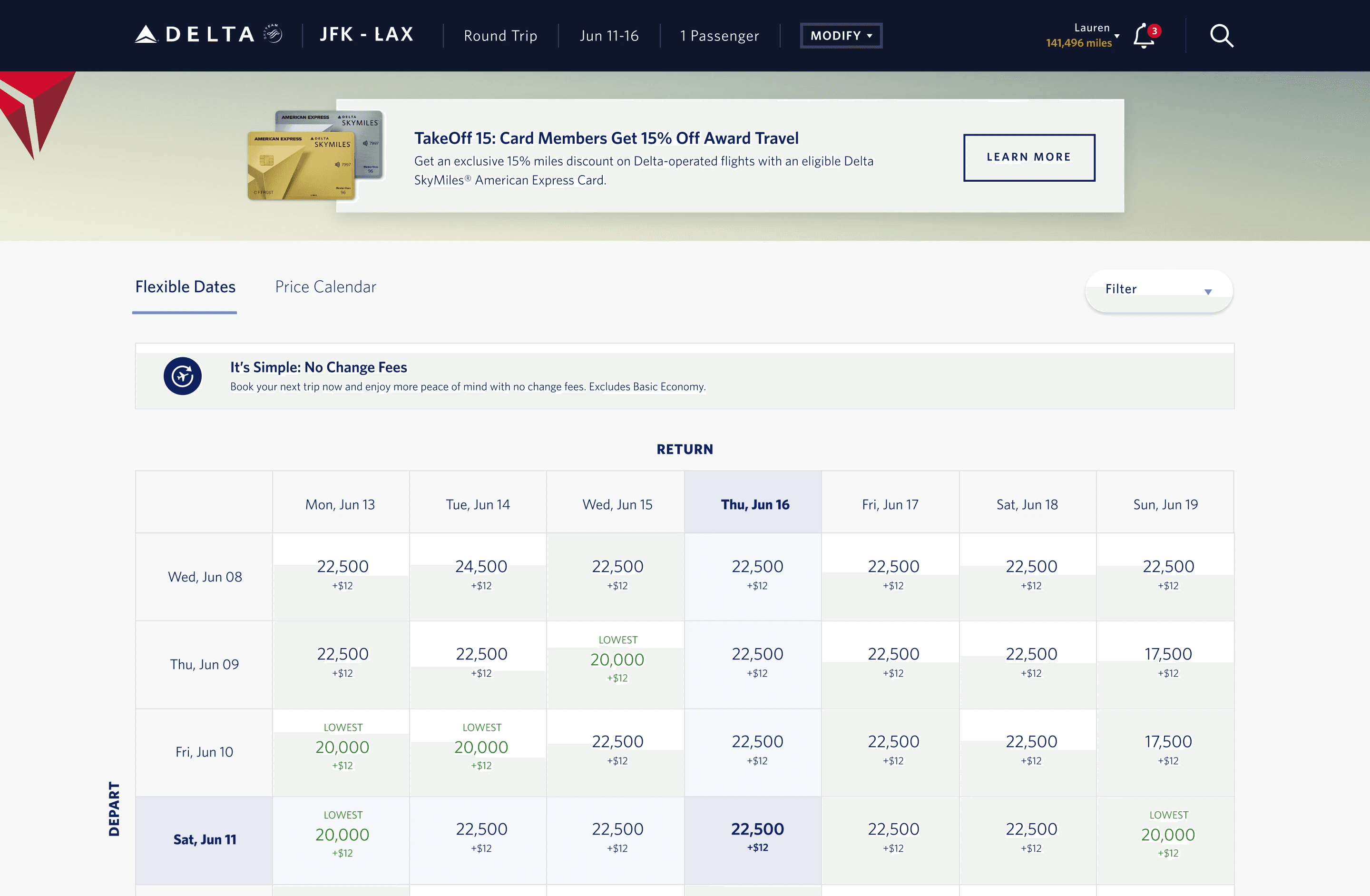
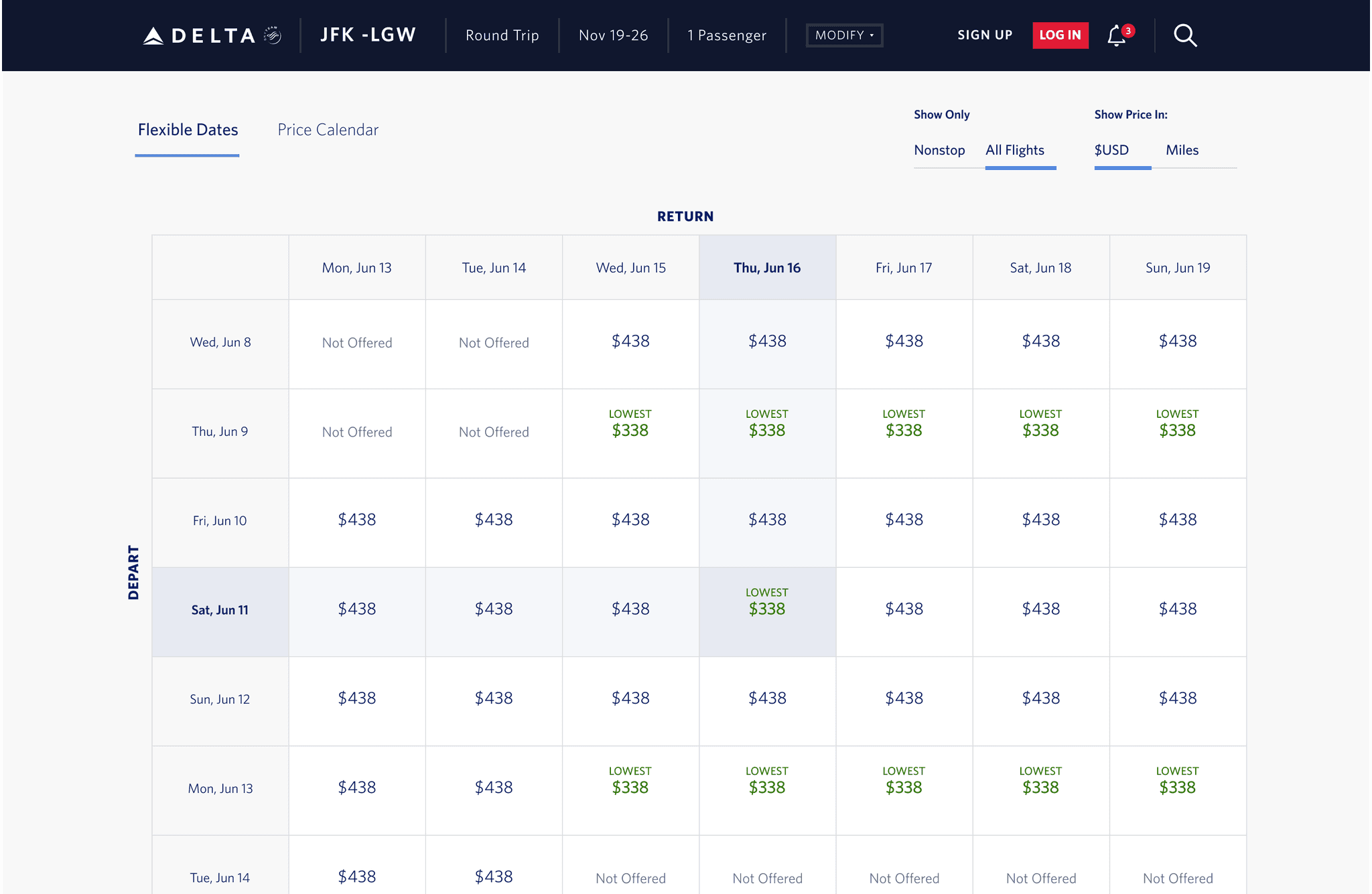
Shop for a Flight (SFAF) enables customers to search and view flights between city pairs. This includes Flex Dates, Price Calendar, Search Results, and Flight Specific Modals. It also provides the option to view flight details, seats, amenities & meals, aircraft specs and performance statistics. This capability is used by 2.3 million users and averages 1 million transactions per day.
Features and Requirements
Elevate user experience of our website by implementing a comprehensive solution that encompasses lazy loading, optimized load times, and engaging animations.
Lazy load images, scripts, and other resources to improve initial load times of Flex Dates, Price Calendar, Search Results, and Flight Specific Modals
Introduce engaging and smooth animations to enhance user interactions.
Provide comprehensive guidance for developers and maintainers.
Approach
Implement a visually pleasing loading strategy that prioritizes critical assets. Ensure compatibility across major browsers to create a consistent user experience.
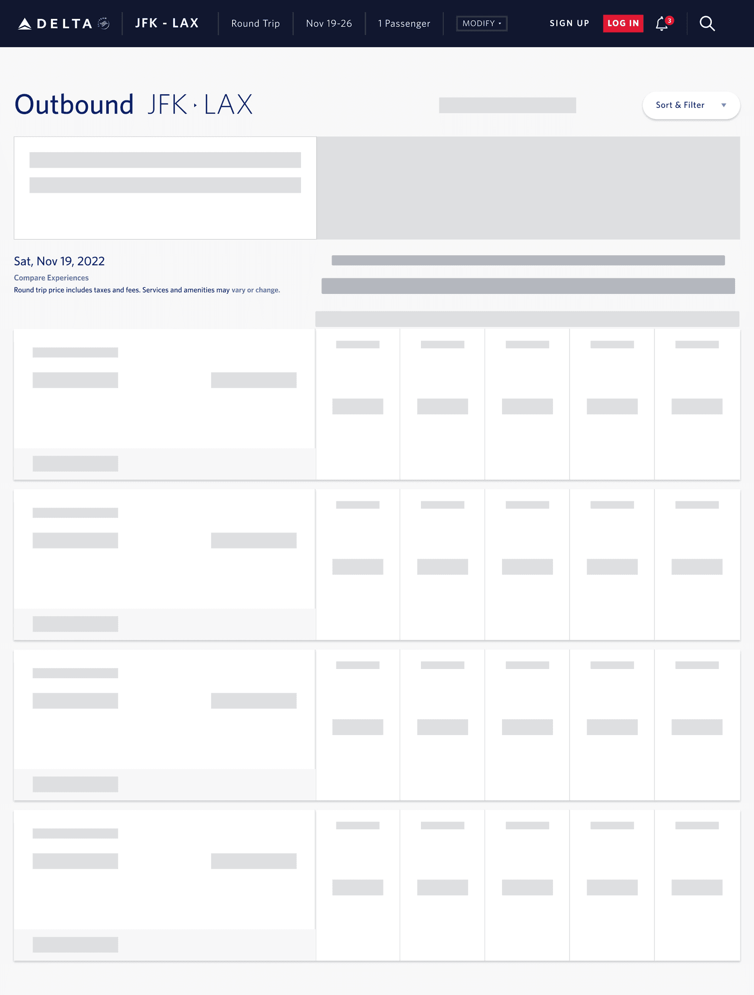
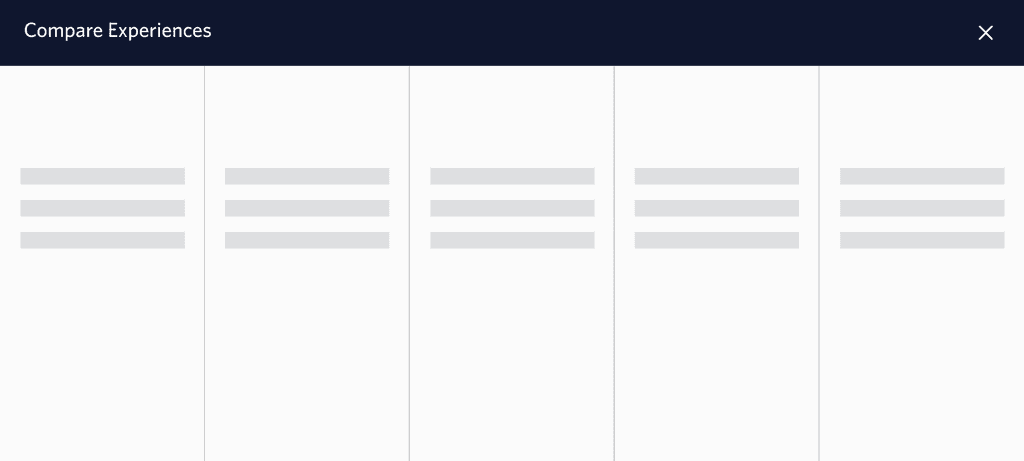
Design lightweight and informative skeleton screen components for modals and flexible pages.
Conduct usability testing to evaluate loading experiences, animations, and responsiveness.
Create guidelines for animation implementation and modification of skeleton screens.
Process
Discovery
UX and UI Design
Integration
Testing, Results, and Reflection
Project Details
Project Duration: 6 Months
Team: 1 Scrum Master, 1 TPO, 1 Product Owner, 5 Developers, 1 QA, and 1 Designer.
My Role: UX/UI Designer
Platforms and Tools
Platform: Responsive web across desktop, tablet, and mobile
Tools: Figma and Version One
Desktop Mock Ups
Discovery
1.1 Problem Statement
Delta Airlines’ search results currently experience noticeable loading delays, leading to user frustration and potential drop-offs due to a lack of visual feedback during wait times. Implementing lazy loading and skeleton loading would provide immediate feedback and progressively load content, reducing perceived wait times and improving user engagement and satisfaction.
1.2 Needs, Pain Points, and Expectations

Needs
Faster Load Times: Users expect search results to load quickly and efficiently.
Visual Feedback: Users require immediate visual cues that indicate content is loading.
Seamless Experience: Users expect a smooth, uninterrupted browsing experience when searching for flights.

Pain Points
Delayed Search Results: Long wait times without feedback cause frustration.
Uncertainty: Users feel uncertain if the system is working due to the lack of loading indicators, leading to potential abandonment.
Poor Perceived Performance: Although load times aren’t excessive, the lack of feedback makes site seem slow and unreliable.

Expectations
Responsive Interface: Users expect a responsive interface that reflects progress as the search results load.
Instant Feedback: Users expect skeleton screens or loading animations to keep them engaged while waiting.
Optimized Performance: Users expect a high-performance website that delivers without unnecessary delays.
1.3 Analysis of Lazy Loading Examples in Various Websites
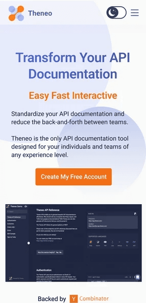
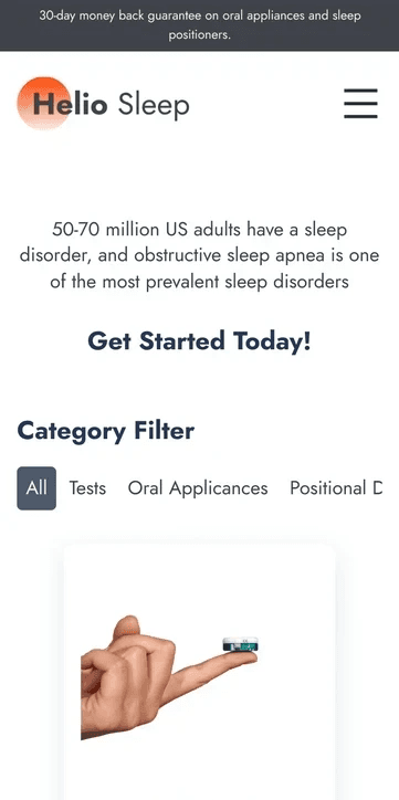
I explored a variety of applications across different industries and purposes. During my research, I observed the animation and data structure involved in loading items.
Key Findings:
User Interfaces (UI) and User Experiences (UX) varied significantly, reflecting the unique nature of each application.
Navigation structures, visual elements, and interaction patterns were identified to understand prevailing design trends.
Lazy loading techniques were observed in several applications, enhancing initial load times by deferring the loading of non-essential resources.

LinkedIn uses a skeleton screen to indicate that the page is loading and to give users a sense of how the page will be structured.
1.4 Doherty Threshold
One of the features that is critical to a good user experience is performance. Emotions can quickly turn to frustration and leave a negative lasting impact when users who are trying to achieve a task are met with slow processing, lack of feedback, or excessive load times. Speed should be considered an essential design feature that is core to a good user experience.
Productivity soars when a computer and its users interact at a pace (<400ms) that ensures that neither has to wait on the other. In some cases, the amount of time required for processing is longer than the threshold of 400ms, but that doesn’t mean we can’t provide feedback to the users while the processing is happening in the background. This technique helps to create the perception that a website or an app is performing faster than it actually is.
UX and UI Design
2.1 Shop for a Flight Data Architecture
In-depth research with developers, product owners, and architects was conducted into the methods employed by existing application to load and present data to users.
Key Findings:
The application utilized advanced caching mechanisms to store frequently accessed data locally, contributing to faster data retrieval.
Progressive loading strategies were noted, presenting users with partial data while the remainder loaded in the background for a smoother experience.
Various result items were dependent on different APIs which present the data to the user.

2.2 Developing Steps for Data Loading
2.3 Skeleton UI Design
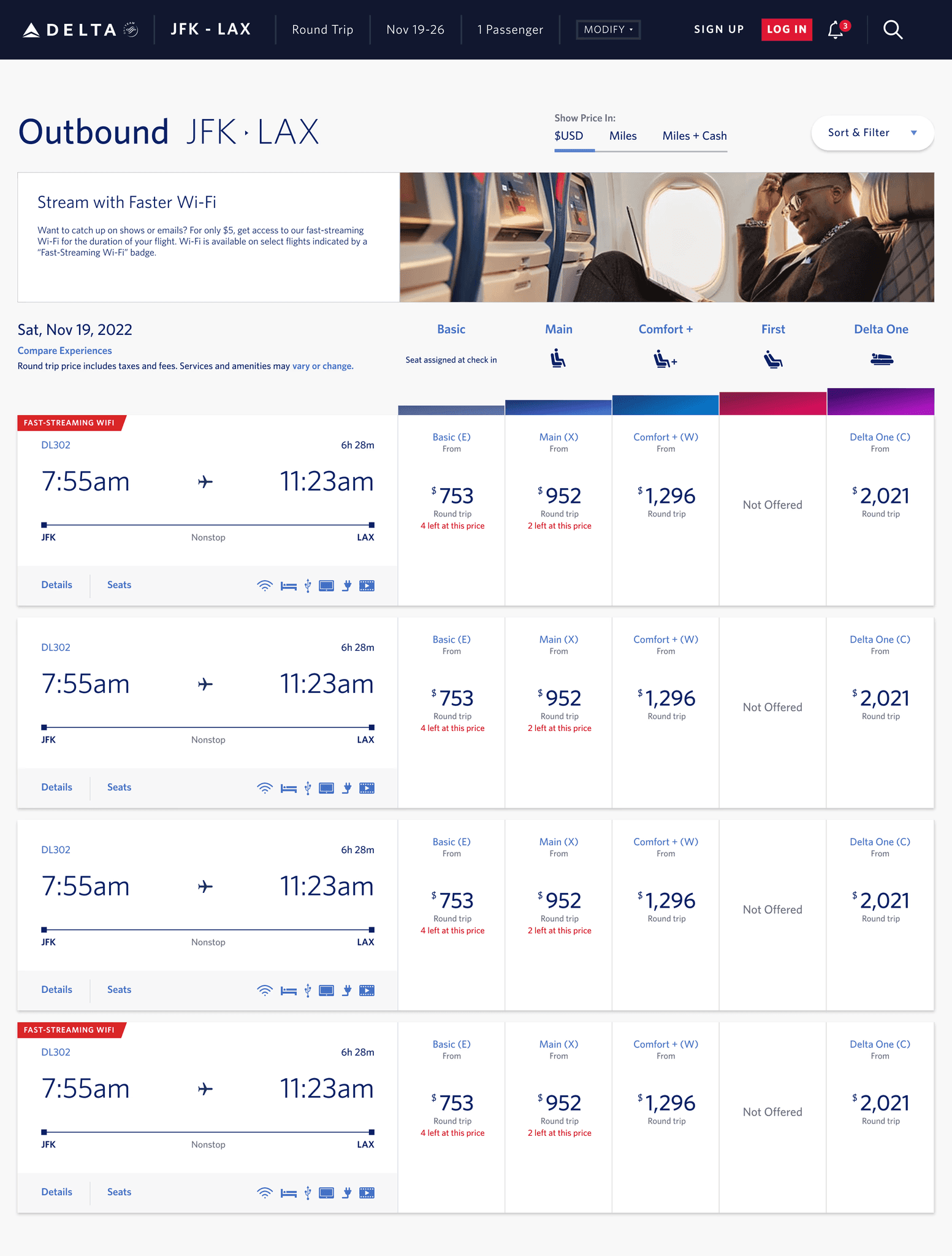
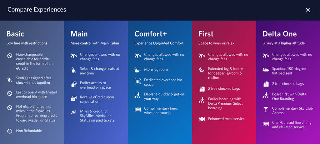
During this phase, I assessed existing designs and removed content reliant on APIs for loading. I established the basic structure of the pages, specifying where the content would be loaded. Given that much of the content hinged on variable results like cabin level, colors, and images, the design adopted a neutral palette to seamlessly accommodate diverse content.
Key Features:
Neutral color scheme
Default settings for common results
Reused and adapted current design skeleton


2.4 Lazy Loading UI Design
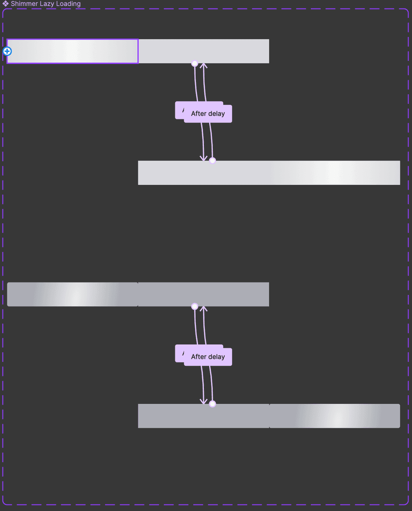
The lazy loading UI design is all about simplicity and efficiency. It's lightweight for quick loading, ensuring a smooth user experience. With both dark and light versions, it's easy to distinguish different items such as content importance hierarchy. It was designed to be future-proof, making it reusable across various Delta websites, adapting seamlessly to changing trends and technologies. In essence, it's a straightforward, fast, and adaptable solution for a range of applications.
Key Features:
Lightweight design for efficiency.
Rapid loading capabilities.
Dark and light versions for item differentiation.
Future-proofed for seamless reuse on different sites.
2.5 Animating Lazy Loading UI
I recognized the importance of incorporating animation to signify content loading to the user. To maintain simplicity and ensure a lightweight user interface, the design iteration focused on employing just two elements: a grayscale box and a gradient variant. The motion was strategically applied to showcase the gradient transitioning from left to right during the loading process, effectively communicating to the user that data and results were in progress. This dynamic animation operates in a loop, seamlessly transitioning to the content upon completion.
2.6 Error and Timeout Handling
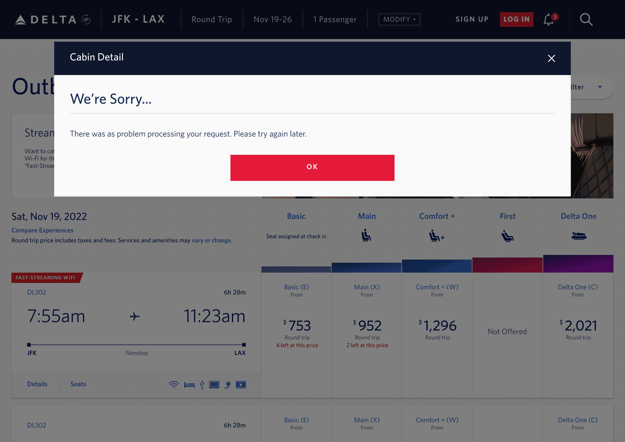
In finalizing the design, I added error messaging for content load failures, such as API issues. The loading animation persists until results show up, but we set a 30-second timeout. If there's no data progress or if the API fails to retrieve information, an error message communicates the issue to the user. This ensures a clear and user-friendly experience.
Integration Across Pages

3.1 Text, Image, Cabin Levels, and CTA
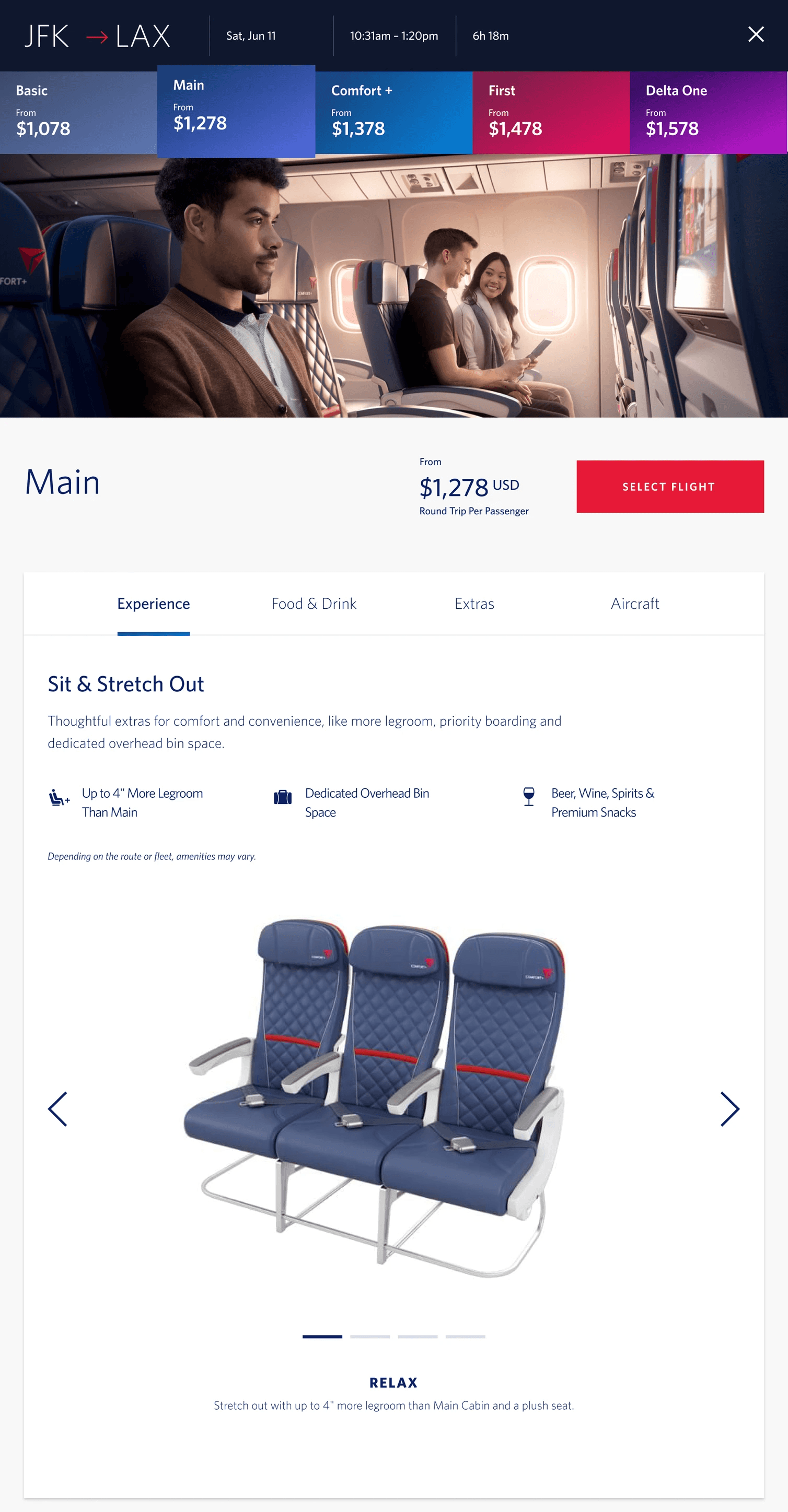
To seamlessly integrate the lazy loading UI across various sections of the website, I began by categorizing content into text, imagery, cabin levels, price, and call-to-action (CTA). The darker version of the UI was applied to items requiring user input, creating a clear distinction from other content. This consistent approach was implemented across shopping pages, effectively conveying the user's information hierarchy. Additionally, this method provided a visual guide for users, outlining the steps they needed to take to progress through the shopping process. Additionally, a persistent close button and letting users click out of the modal was strategically incorporated, offering users the flexibility to return to search results at any point or in case the content failed to load seamlessly.
Key Features:
Enabling CTA after content finished loading
Keeping the close button accessible at all times
3.2 Applying Skeleton and Lazy Loading UI to Flexible Dates and Price Calendar Pages
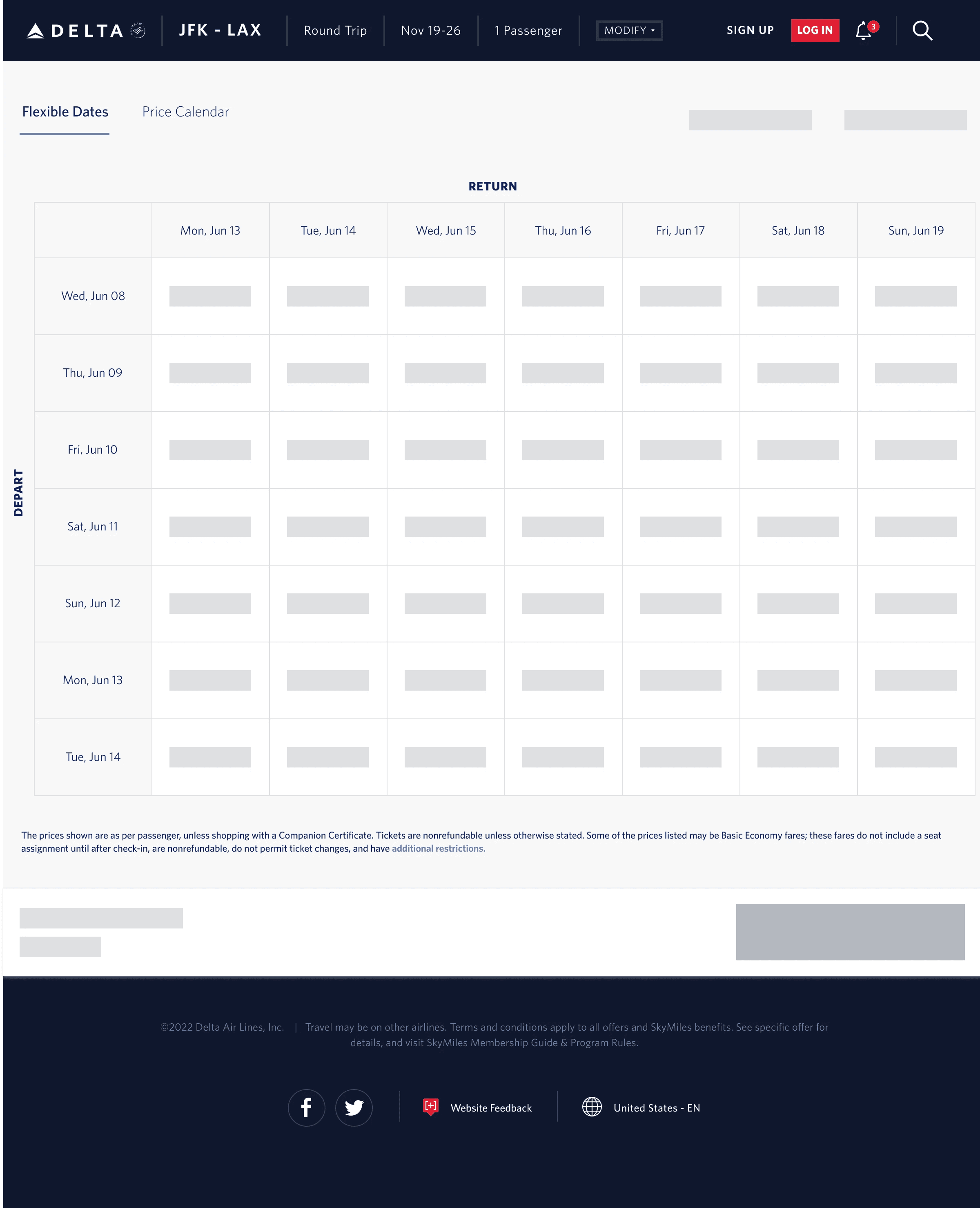
Integrating the skeleton and lazy loading UI into the Flex pages involved a crucial consideration. The grid structure needed to be consistently present beforehand, ensuring dynamic content rendering. Notably, the footer was prioritized as the final element to load, aligning with the user flow where a selection made in the grid reflects in the footer. To enhance user experience, the call-to-action (CTA) is intentionally disabled until data retrieval, preventing users from making decisions on unseen prices and emphasizing a user-centric approach to interaction.

3.3 Tablet and Mobile Incorporation
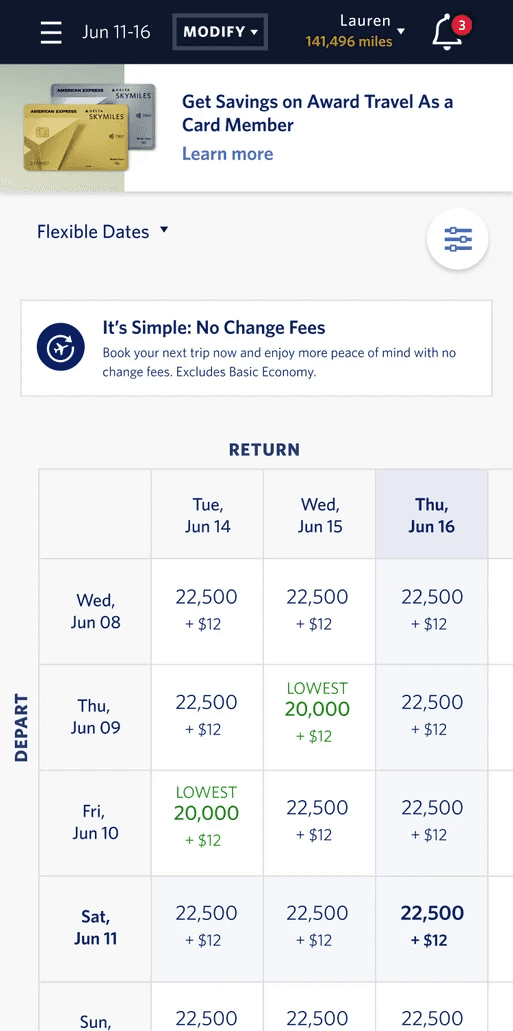
To adapt the discussed UI enhancements for mobile devices, a streamlined approach was employed. Since lazy loading design are adaptable in size, it was an easy incorporation to add it to the mobile version by resizing elements. The dynamic loading sequence for all pages were tailored to the mobile and tablet layout, prioritizing user interaction and ensuring a smooth journey through the content. Overall, these design elements were thoughtfully adapted ensuring consistency in hierarchy and styling between desktop and to mobile and tablet devices
Mobile Mock Ups
Testing, Results, and Reflection
4.1 Boosted Conversions and User Engagement
Improved Conversion Rates:The experience contributed to a 0.15% increase in conversion rates, directly boosting revenue. Users were more likely to complete bookings with reduced friction in the search process.
Enhanced User Satisfaction: Usability tests showed a significant improvement in user satisfaction, with a 65% reduction in load times, especially benefiting users with slower internet connections.
Reduced Perceived Wait Times: Skeleton screens offered users visual reassurance that content was loading, reducing perceived wait times and frustration. This kept users engaged and reduced abandonment rates during the search process.
4.2 Optimized Performance and Development Efficiency
4.3 Reflection
These results highlight how enhancing the user experience directly influences business success. Faster page load times, greater reliability, and increased revenue all point to the strong connection between customer satisfaction and the platform’s overall performance.
Looking back on these achievements, it’s evident that user experience is more than just a series of design choices, it’s a comprehensive strategy. Every interaction and detail contributes to the platform’s success. Moving forward, this emphasizes the value of user-focused design. Even the smallest improvements can have a substantial impact, boosting both user satisfaction and business outcomes.
