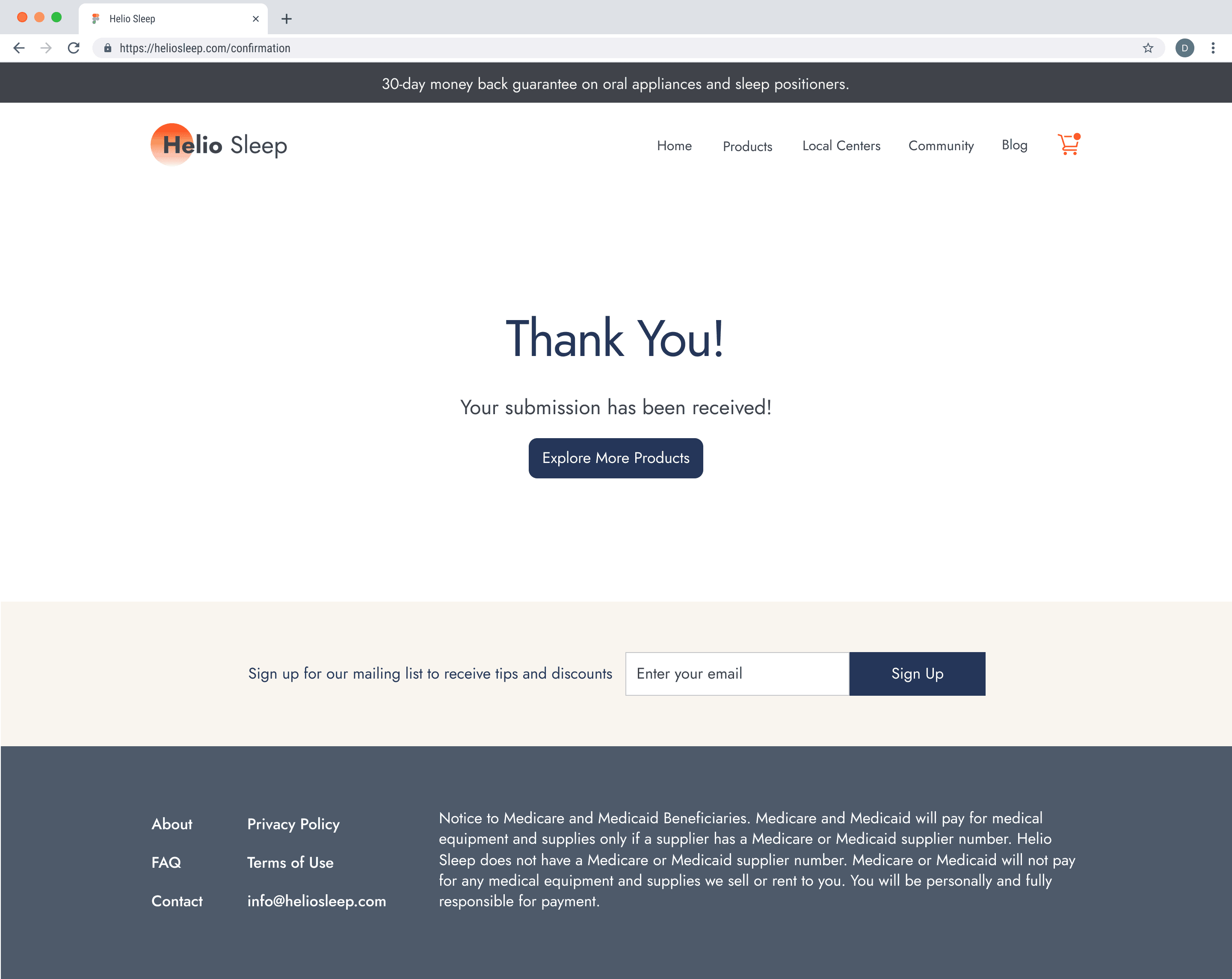
Online Store Redesign to improve experience for customers.
eCommerce
Responsive Web
Redesign

About Helio Sleep
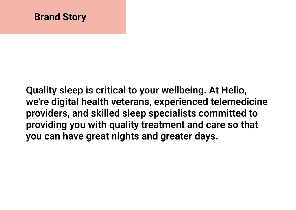
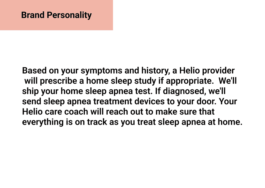
Helio Sleep is an online provider of sleep apnea tests and other devices to improve sleep in customers. Helio Sleep is a small company serving in Washington and Texas and looking to expand its service to more states. The company is also looking to add more products in the future to help those diagnosed with sleep apnea and other sleeping disorders.
Problem
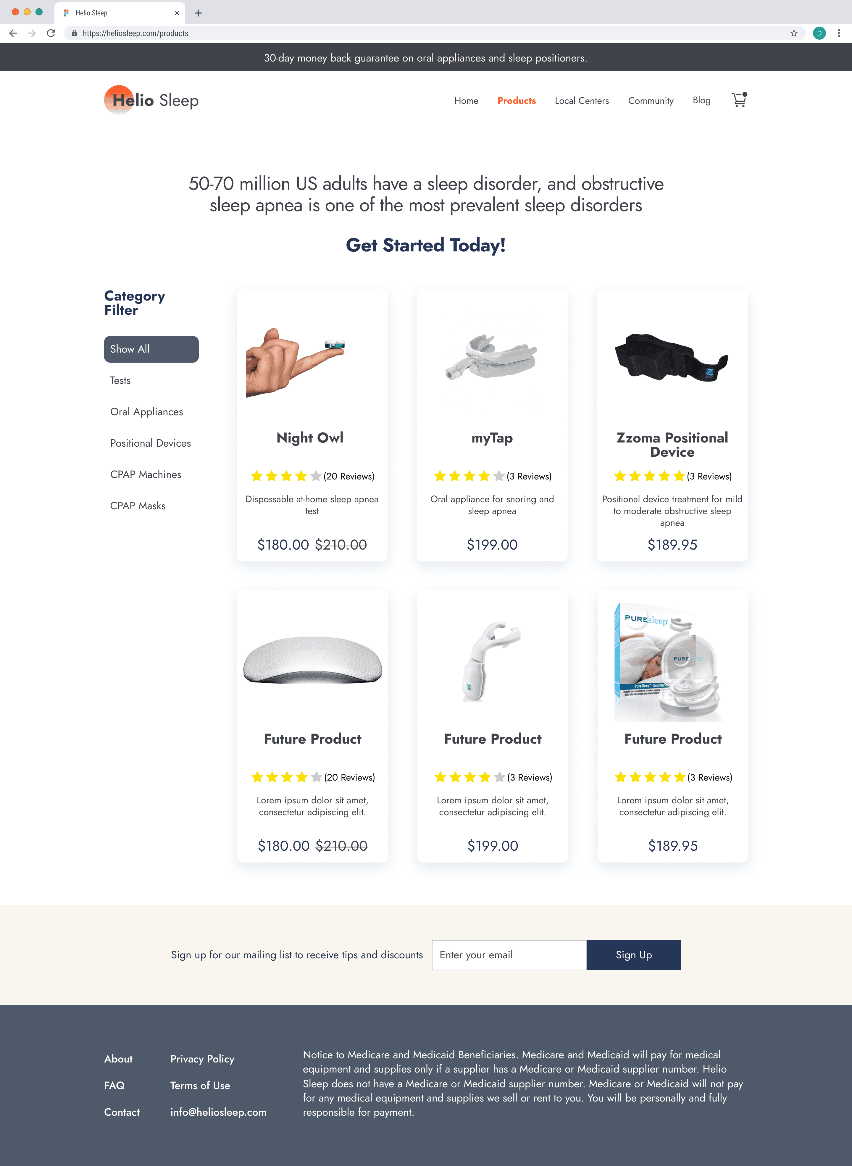
The layout of products and information makes it difficult to showcase the products.
Users do not have enough information on products to make the appropriate decision.
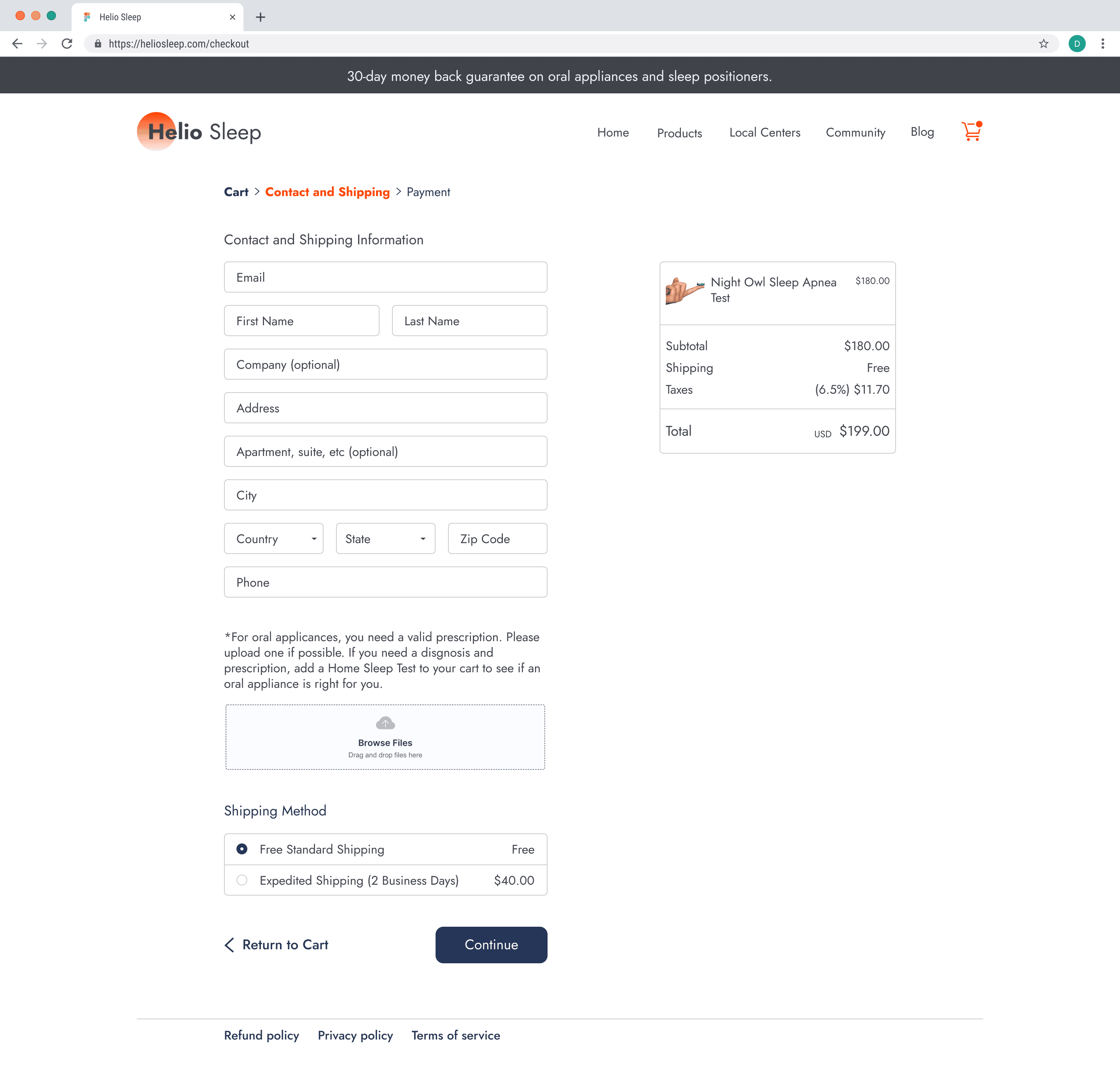
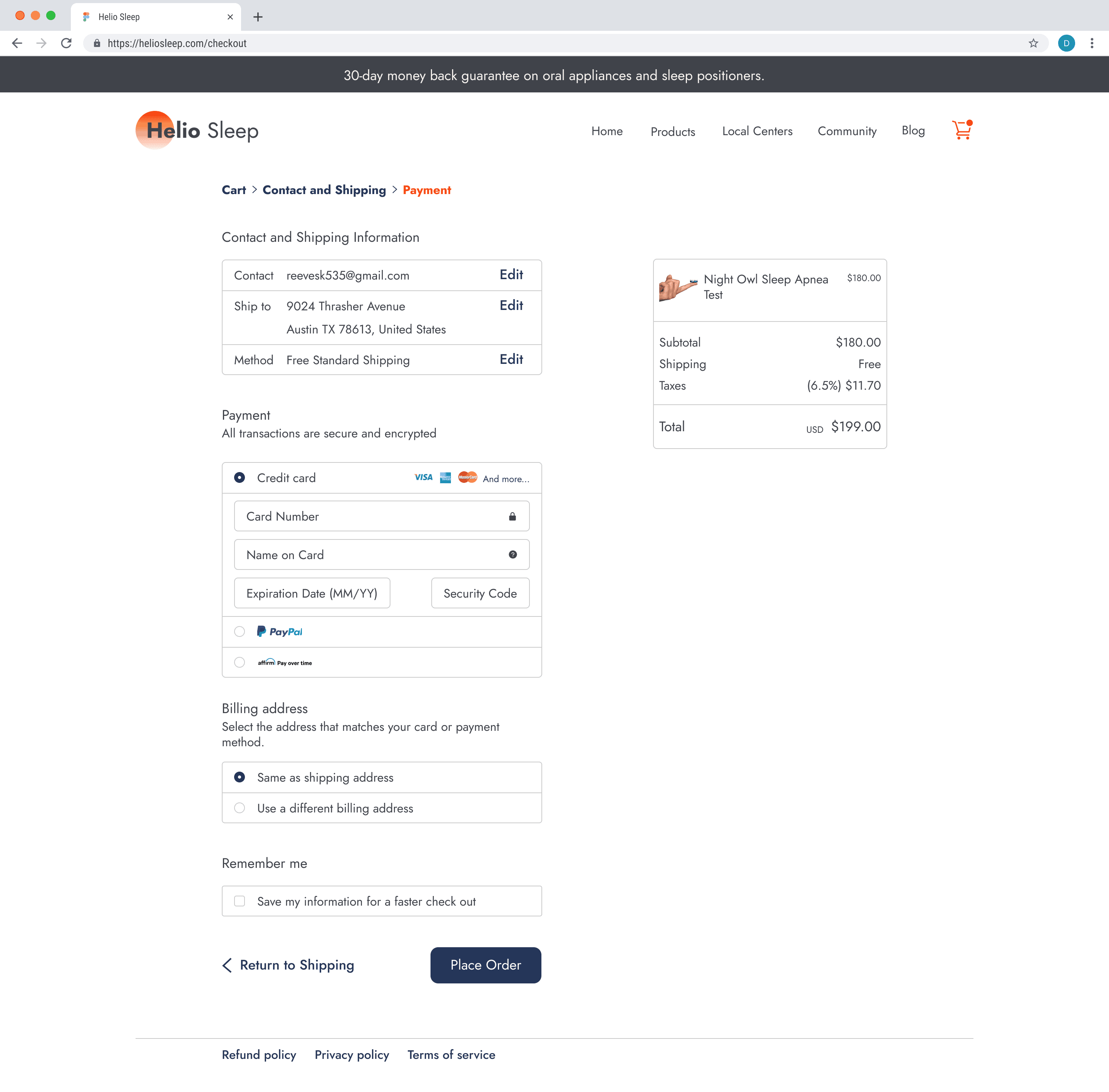
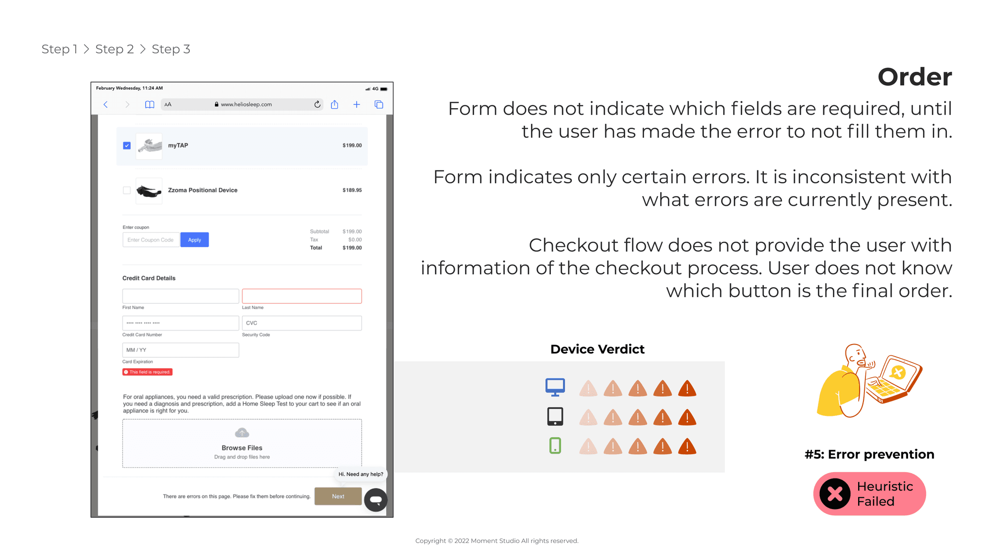
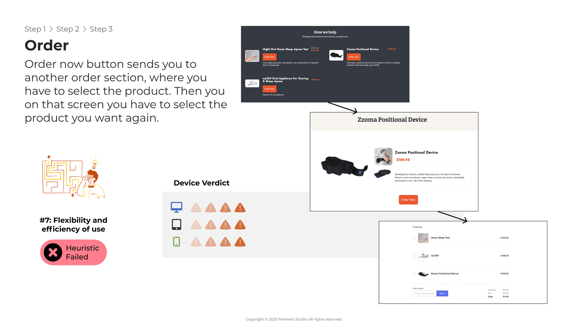
The checkout process includes many flaws that make it difficult for their users to order products.
Solution
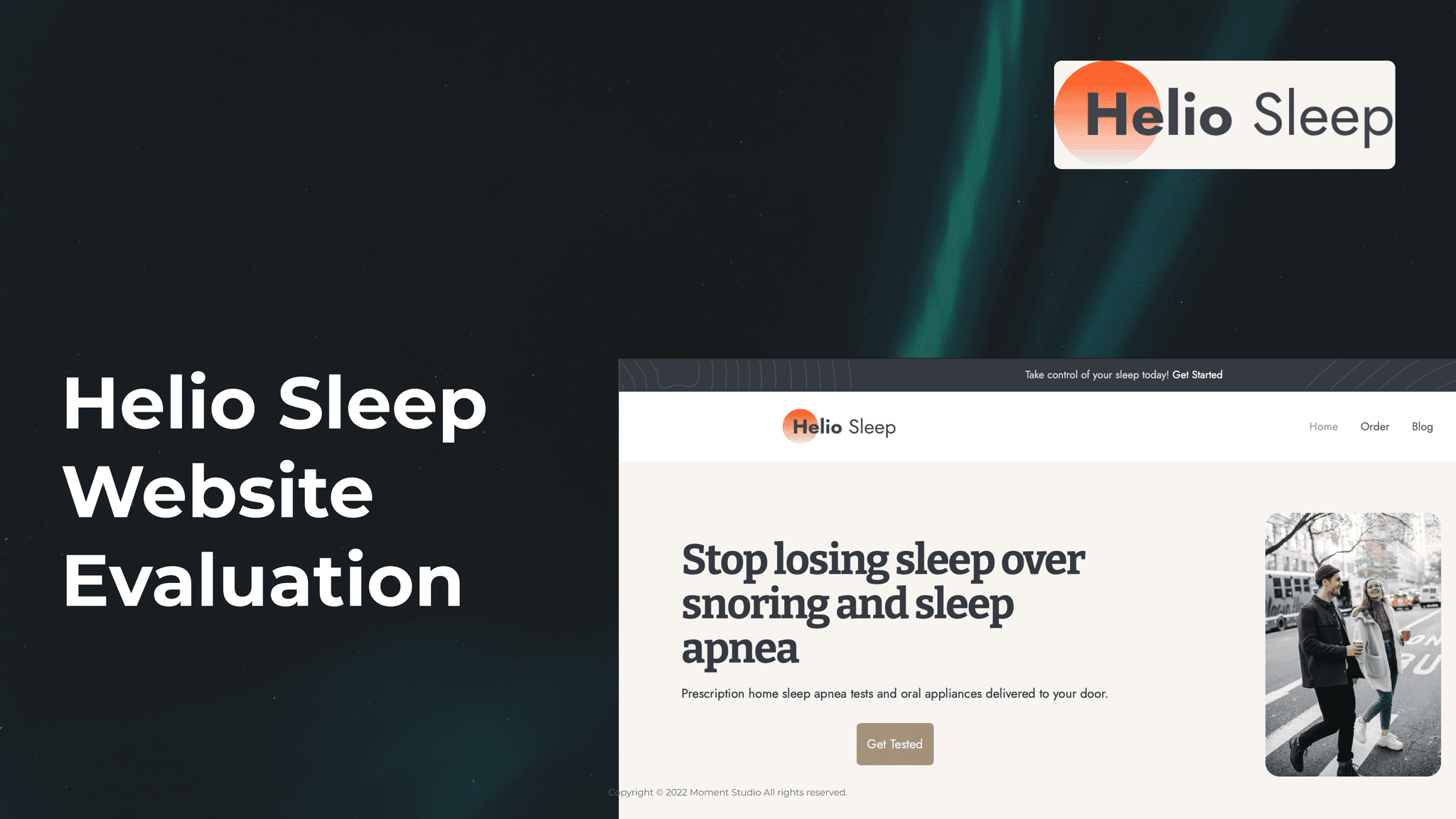
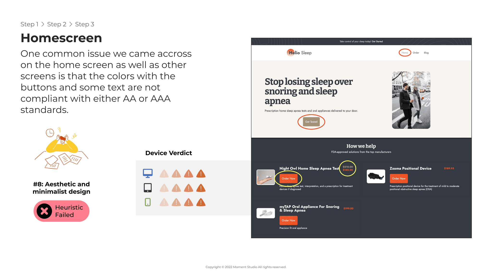
Conduct a Heuristic Evaluation to determine some of the flaws and strengths of the current design.
Improve the product landing page by redesigning the layout
Include more accurate and helpful information regarding the different products.
Redesign the checkout process to improve instructions and clarity.
Process
Heuristic Evaluation
Discovery
Ideation
Wireframing
Hi-fidelity
Prototype
Developer handoff
Project Details
Project Duration: 2 Months
UX/UI Designer in a team of 4
Platforms and Tools
Platform: Responsive web for desktop, tablet, and mobile
Tools: User Testing, Figma, and Jira
Discovery
1.1 Heuristic Evaluation
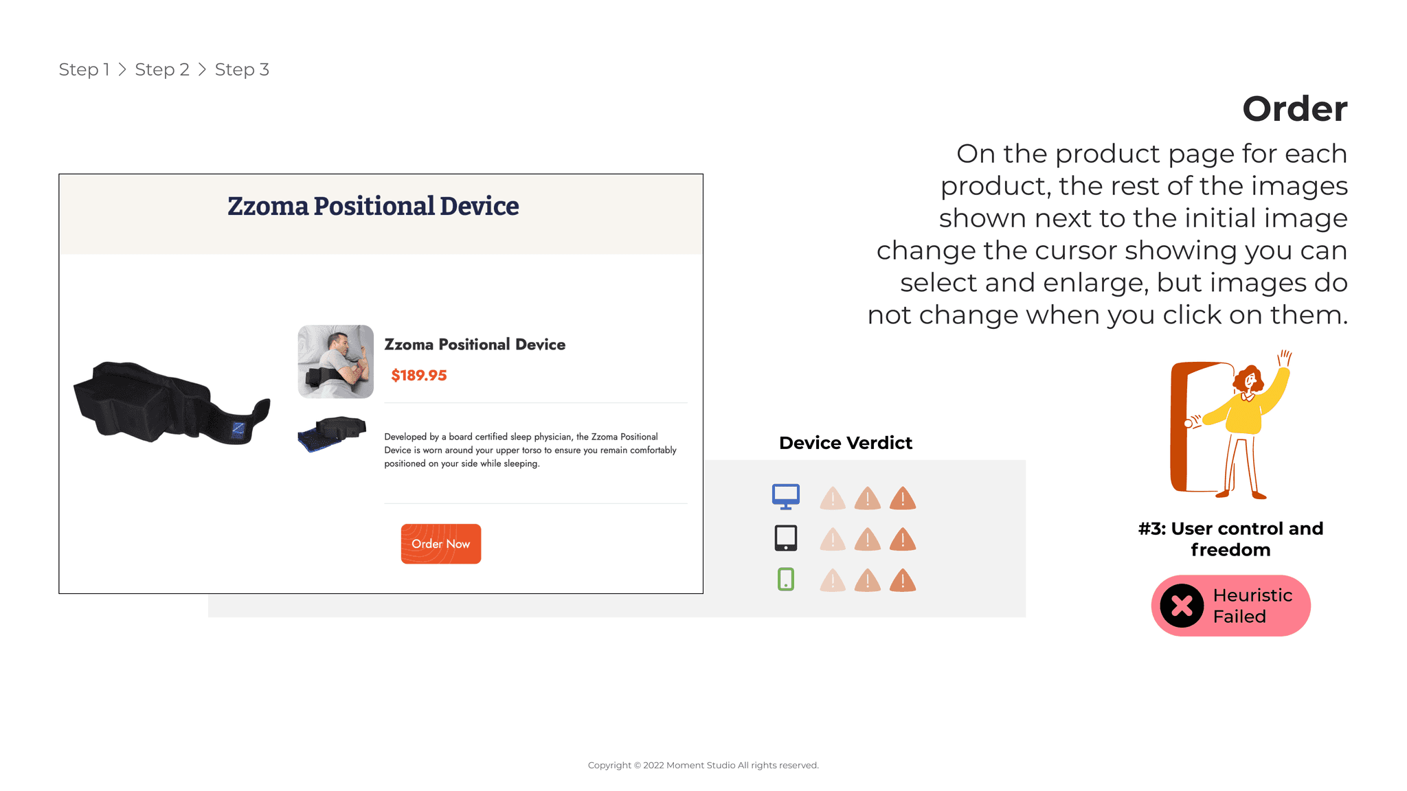
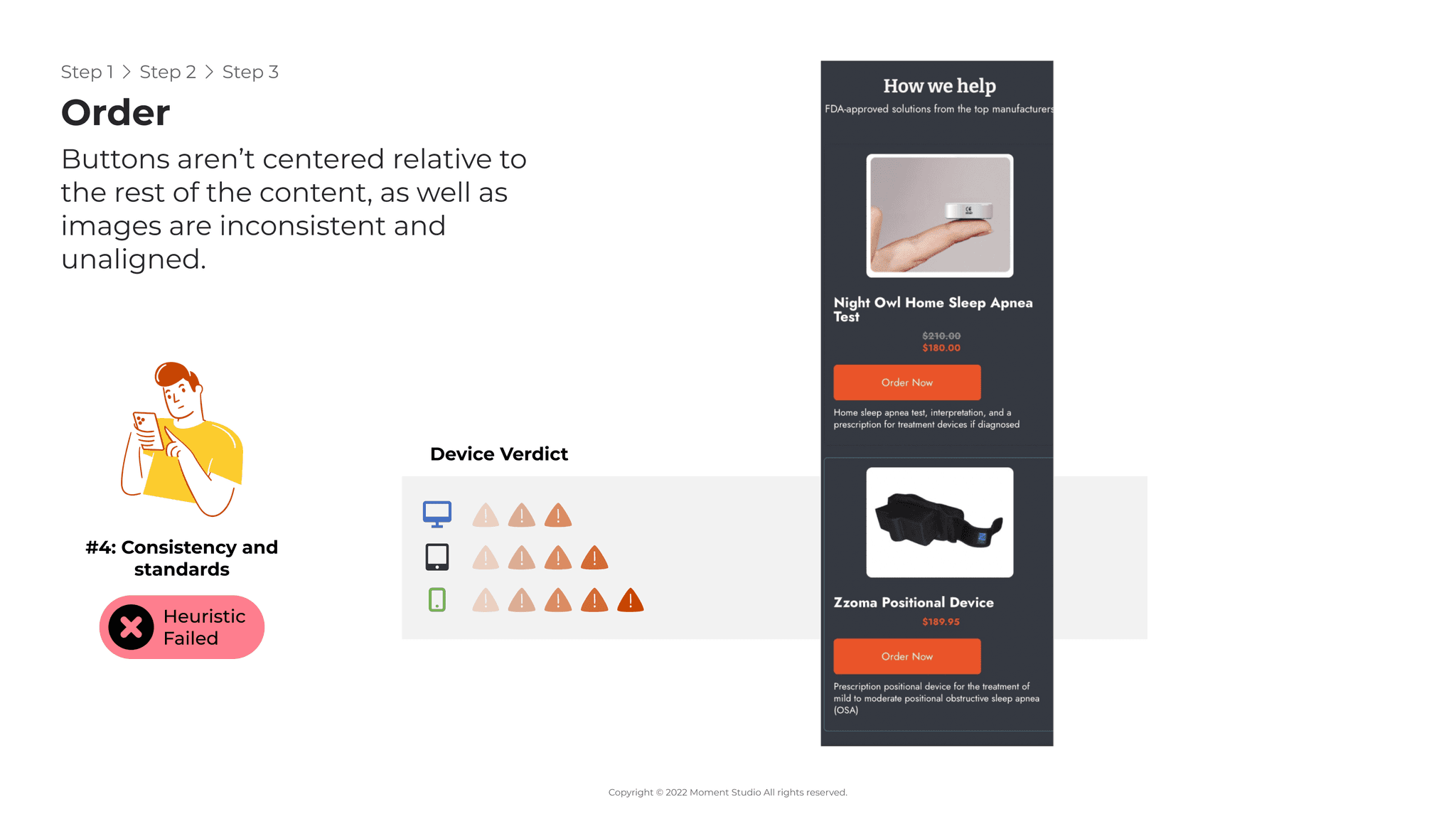
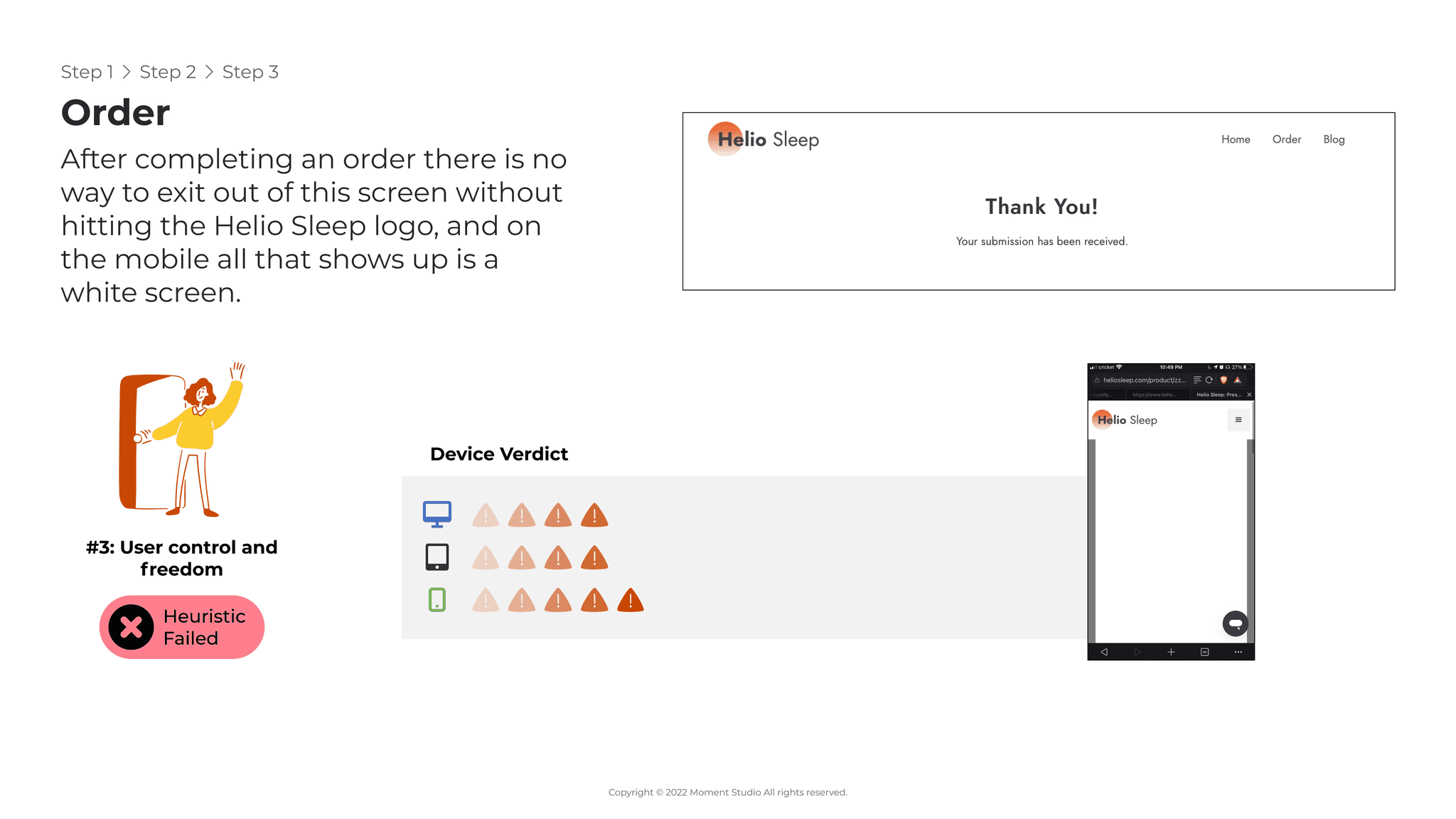
As a team, we did a Heuristic evaluation of their current website. I was in charge of evaluating the tablet versions of their website and found many flaws that did not seem present on other platforms. Vice versa, other platforms found flaws that were not an issue in tablets. This made it very clear that we needed to design for desktop, tablet, and mobile as the different versions of the website had different problems.
1.2 Competitive Analysis
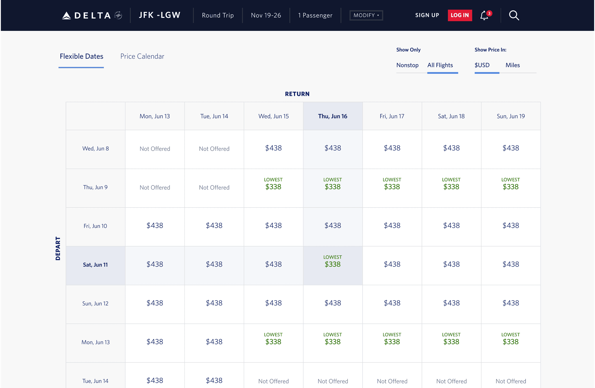
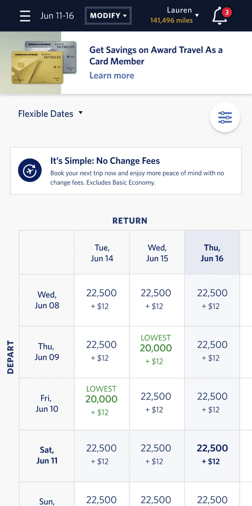
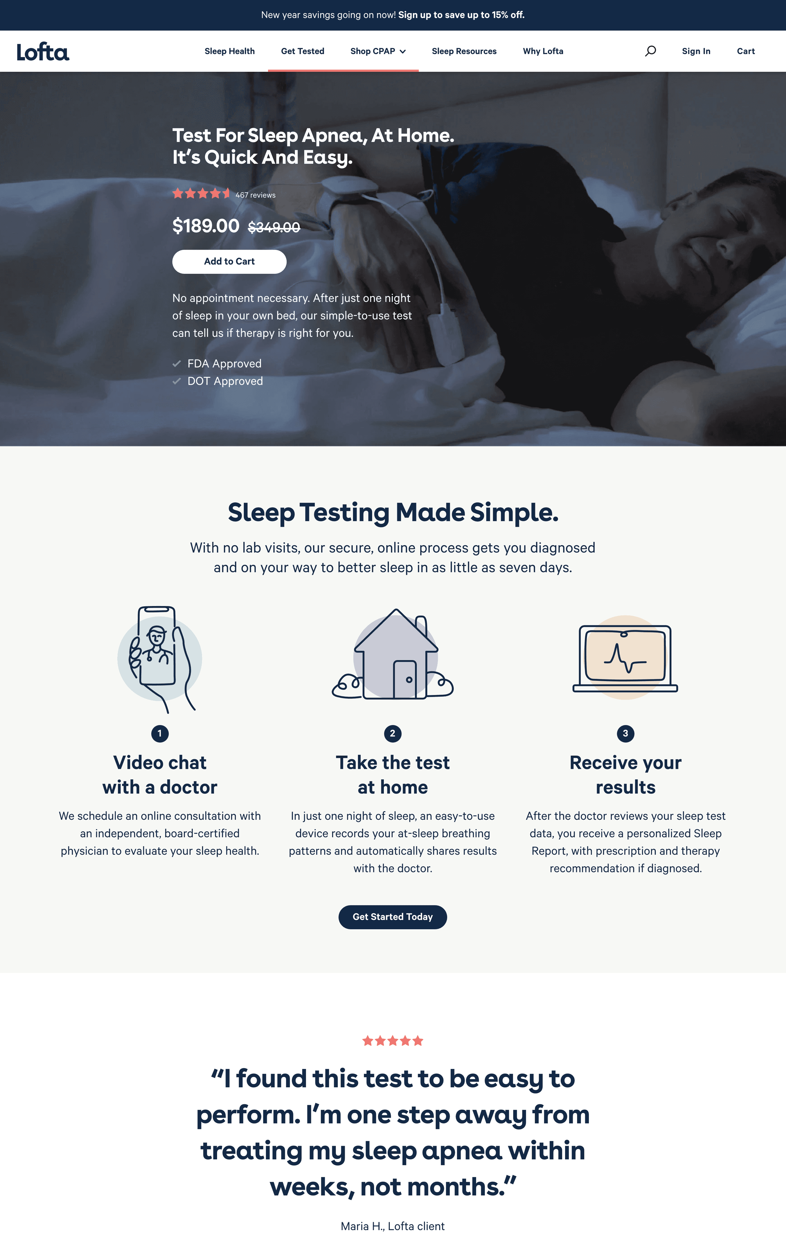
Lofta is another online store that sells sleep apnea tests and devices to customers. By looking at their website, their products have clear information and checkout process. This is helpful to know and understand the eCommerce of sleeping devices and how they function.
Ideation
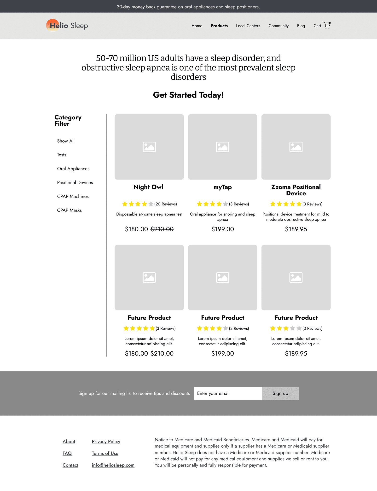
2.1 Products Page Low Fidelity Wireframe
My role for the low fidelity wireframes was designing the product page for Helio Sleep. During this process, I made sure to include space for future products to avoid any spacing problems in the future.
Decision:
Include a short description of the item
Provide pictures to help users easily recognize the product
Include concise pricing in the preview of the devices
Create a filter category so that it can help users sort through more products
2.2 Product Description Low Fidelity Wireframe
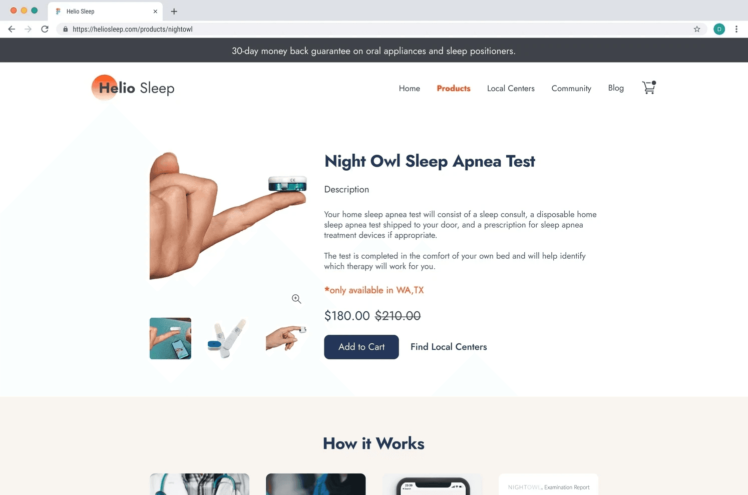
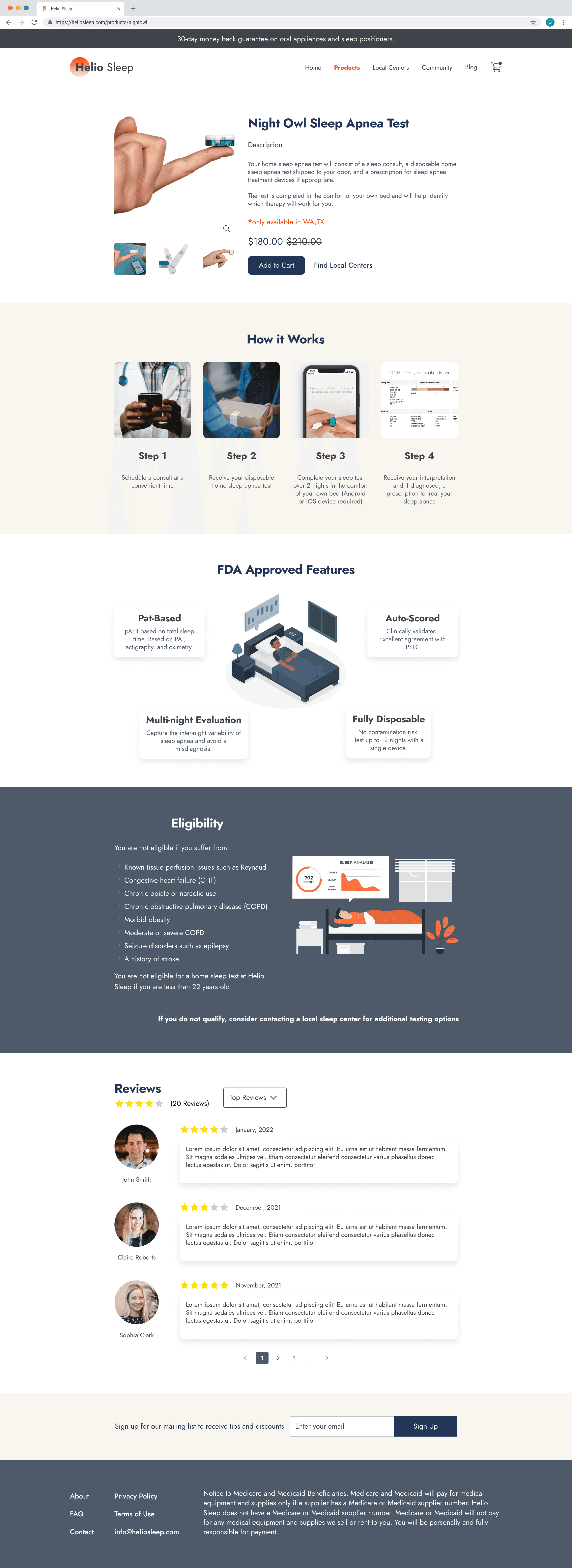
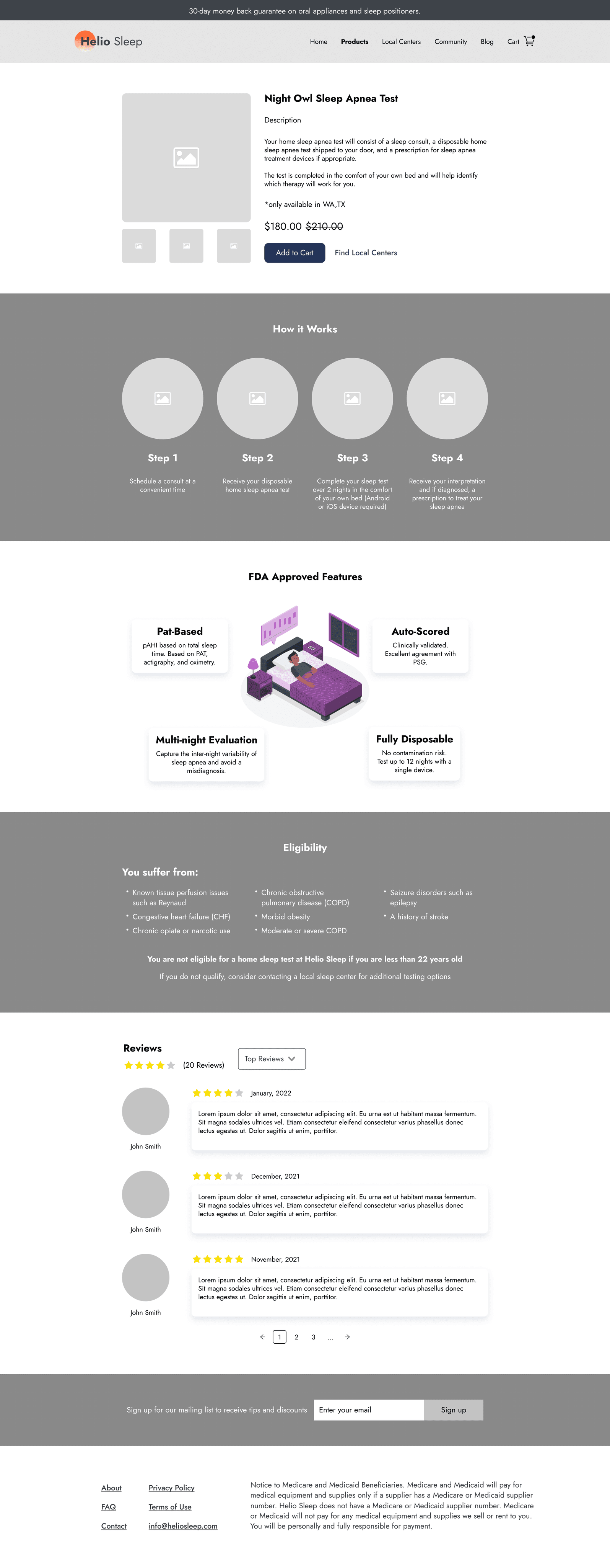
Additionally to creating the main product page, I also design a page that included the description of the devices. This page would further go into detail about the Night Owl Sleep Apnea Test.
Decision:
Present information in an organized design to avoid confusion between products
Show and describe product features, steps, requirements, and reviews
Include pictures to help them understand how it works
Add a reviews section so that other users can get feedback from other costumers
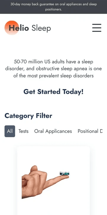
2.3 Translating Design to Mobile
To make sure the same design translated into Mobile, I made sure that the card sizes, font, and other components were the same size across devices Although some items had to be rearranged, it still preserved its core function and size.
Design
3.1 Style Guide
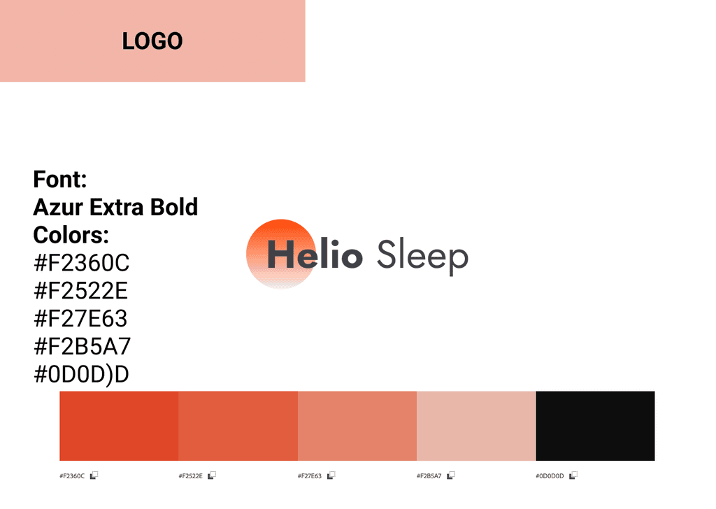
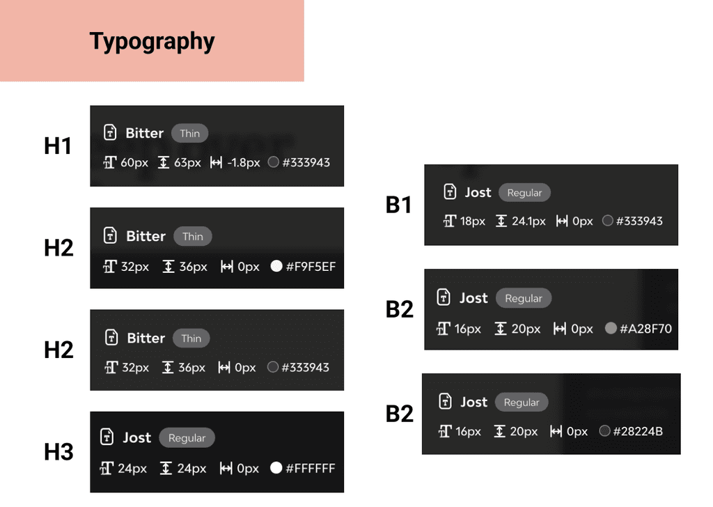
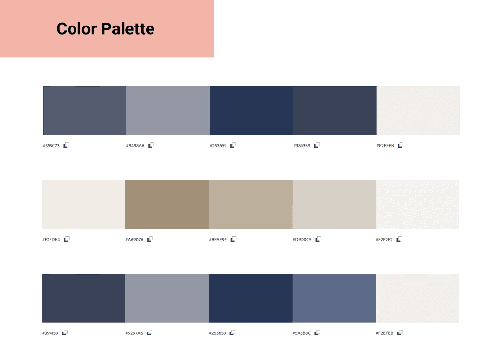
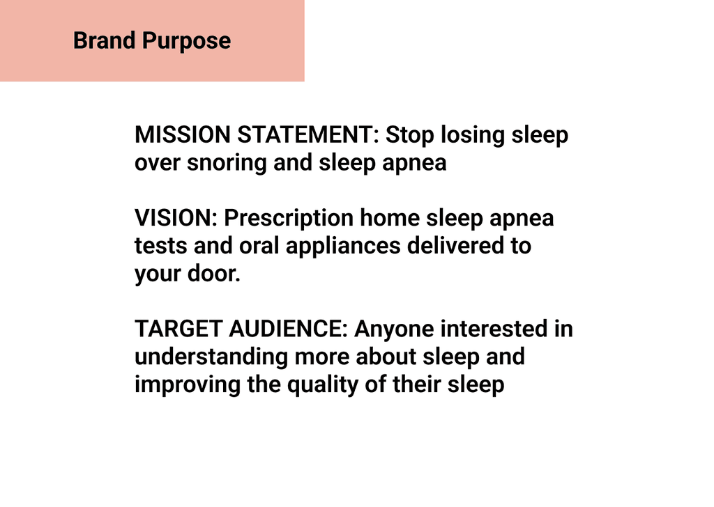
To ensure consistency across the different devices and screens, the team developed a style guide to match the current Helio Sleep Website. This made it easier for the team to design colors, fonts, and sizing for components.
3.2 High Fidelity Wireframes
With the style guide set, the team started working on designing the final UI for the screens. We used the orange color sparingly to make sure that it wasn't too harsh for the users. We also decided to use blue for the main CTA actions and majors descriptions.
Prototype
4.1 Prototype
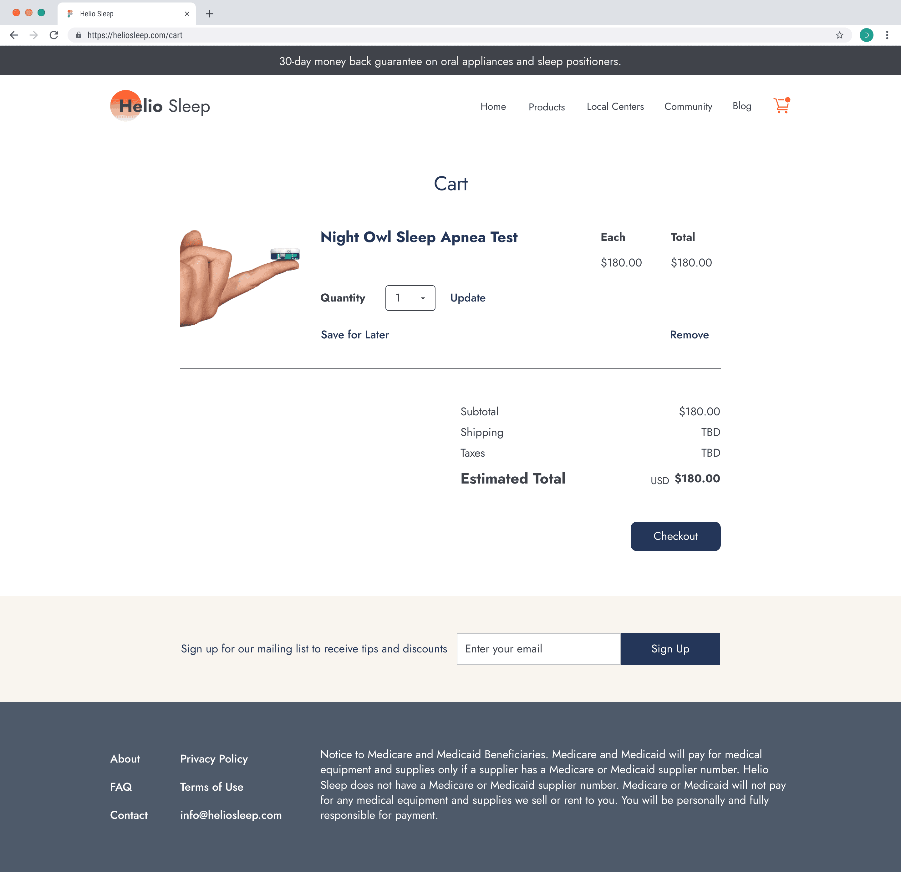
Using Figma we developed a prototype of the Helio Sleep website while focusing on the product ordering process. I made sure to clean up any small spacing, color, misspellings, functionality, and user error before testing with any users. We internally tested to make sure that the prototype did not cause users to get stuck on a screen. Finally, we made sure that the checkout flow was easy and a straightforward process for the user.
4.2 User Testing Plan
Conduct an unmoderated study through User Testing to see if users are finding everything clearly and how we could potentially design it better to help the user. The goal is to successfully learn about the NightOwl Home Sleep Apnea Test and purchase it.
Questions
Find the NightOwl Home Sleep Apnea Test and purchase it.
Was it hard to find the product?
Did the layout have the information needed for you to buy the product?
Did the website give the requirements needed for the product?
The website was easy to maneuver through
Was it easy to choose the product?
Was it easy to add it to the cart?
Was it easy to follow the checkout process?
Are there any ideas or thoughts you might have that you think we might find valuable?
4.3 User Testing Results
Results
The user testing results showed that all participants were able to successfully complete the ordering process. Additionally, all participants also found all the information very easy to read and find. Overall, the design worked well for the users.
4.4 Developer Handoff
Once our design proved to be successful, we began to annotate the notes needed for the developers. The team made sure that all the interactions in the design were described as how they should react on the website. Sizes for pictures and spacing were also added to the designs so that developers have an accurate reference of sizes. Lastly, we also included HEX codes for the colors of items as they change states.
Reflection
5.1 Reflecting on the Project
This design made me take into consideration the needs of the user in an e-commerce setting. Users need to be able to understand products quickly and throughout in order to make a decision while purchasing. Additionally, the steps required to purchase a product online need to be straightforward and concise. This will lead to less users getting lost or confused while shopping online
5.2 Looking Ahead
Using the knowledge of designing for e-commerce, will give me a better perspective into how to make better decisions in other problems. Understanding what the user needs in order to make a decision while shopping is very important. This research will lead to better design to make their shopping experience more enjy

