About Delta Airlines Flexible Dates and Price Calendar Pages
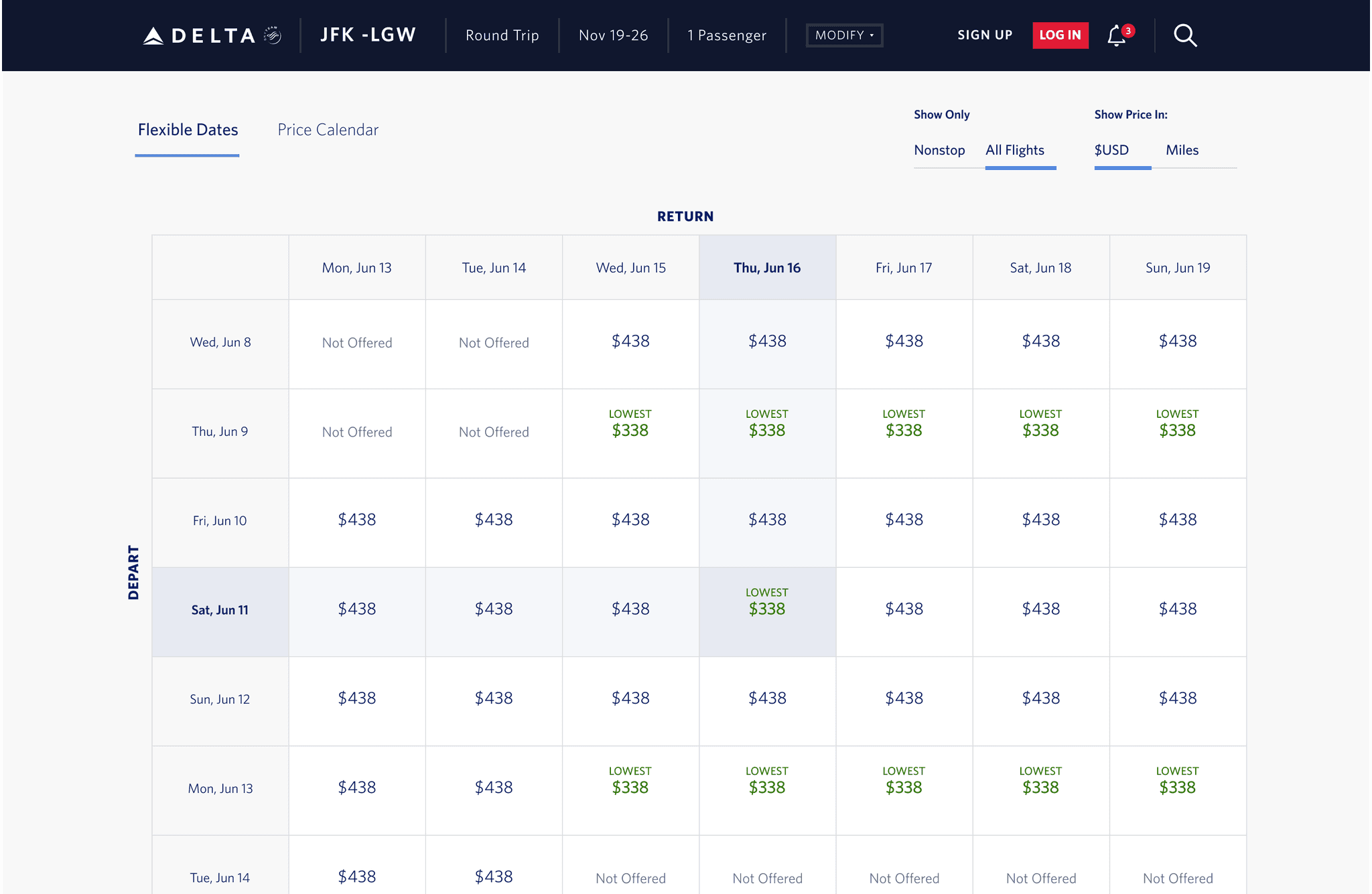
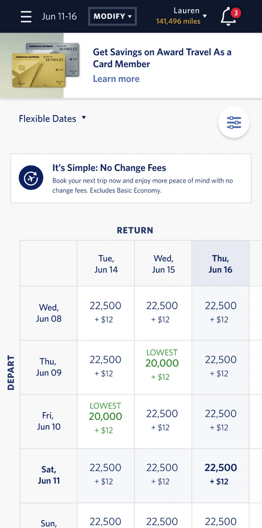
Delta Airlines' Flexible Dates and Price Calendar Pages allow travelers to easily view and compare flight prices across a range of dates. These tools help users find the most cost-effective travel options by displaying fare variations, enabling flexible travel planning, and simplifying the booking process.
Problem
Approach
Process
Discovery
Researched Backed Design
Reflection
Project Details
Project Duration: 3 Months
Team: 1 Scrum Master, 1, TPO, 1 Product Owner, 4 Developers, 1 UX/UI Designer, and 1 QA
My Role: UX/UI Designer
Platforms and Tools
Platform: Responsive web for desktop, tablet, and mobile
Tools: Figma and Version One
Discovery
1.1 Understanding the Problem with Filter Options
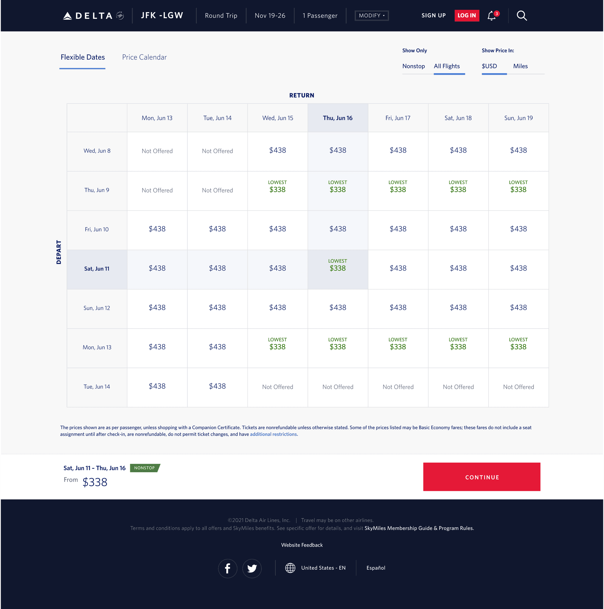
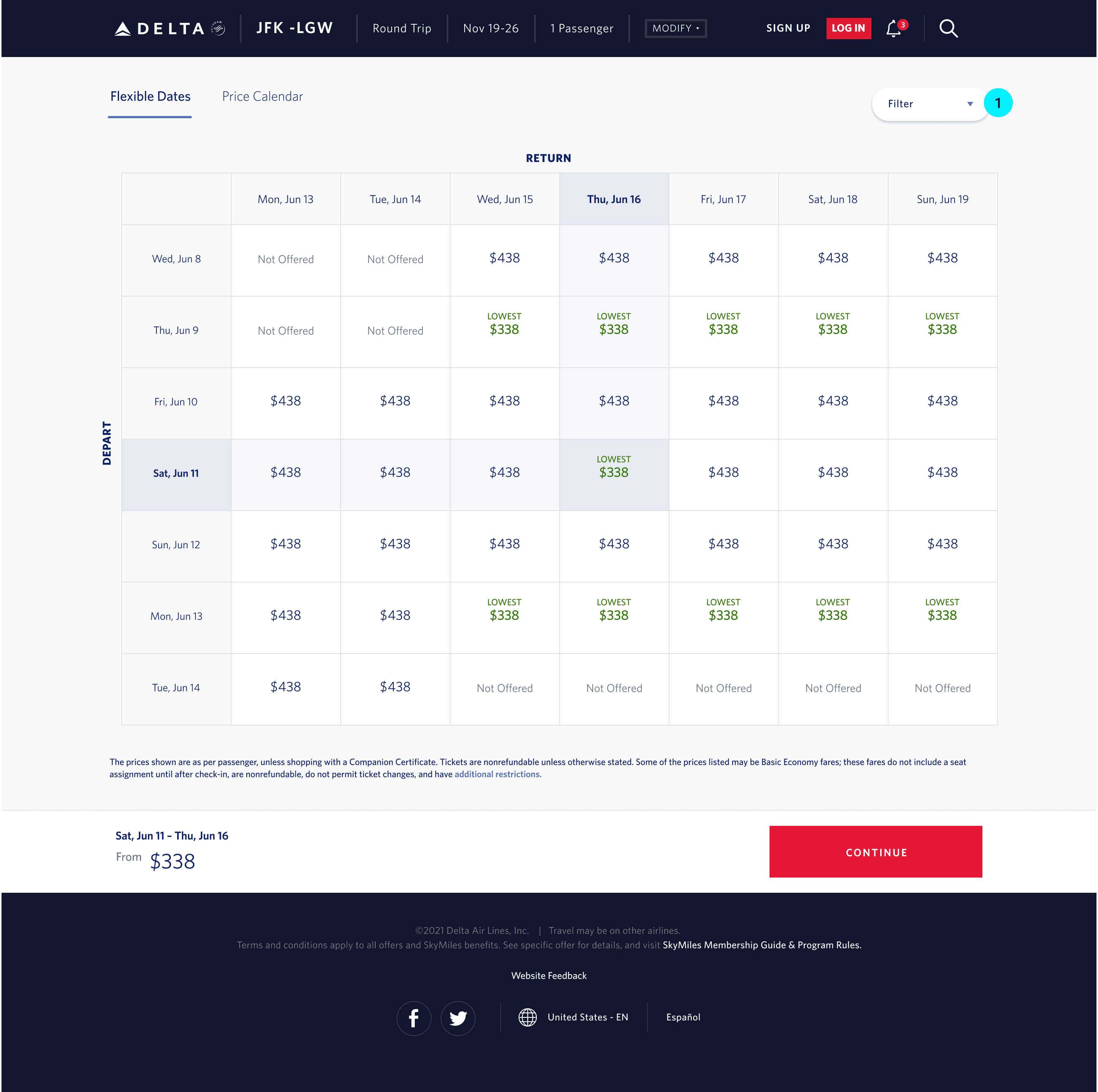
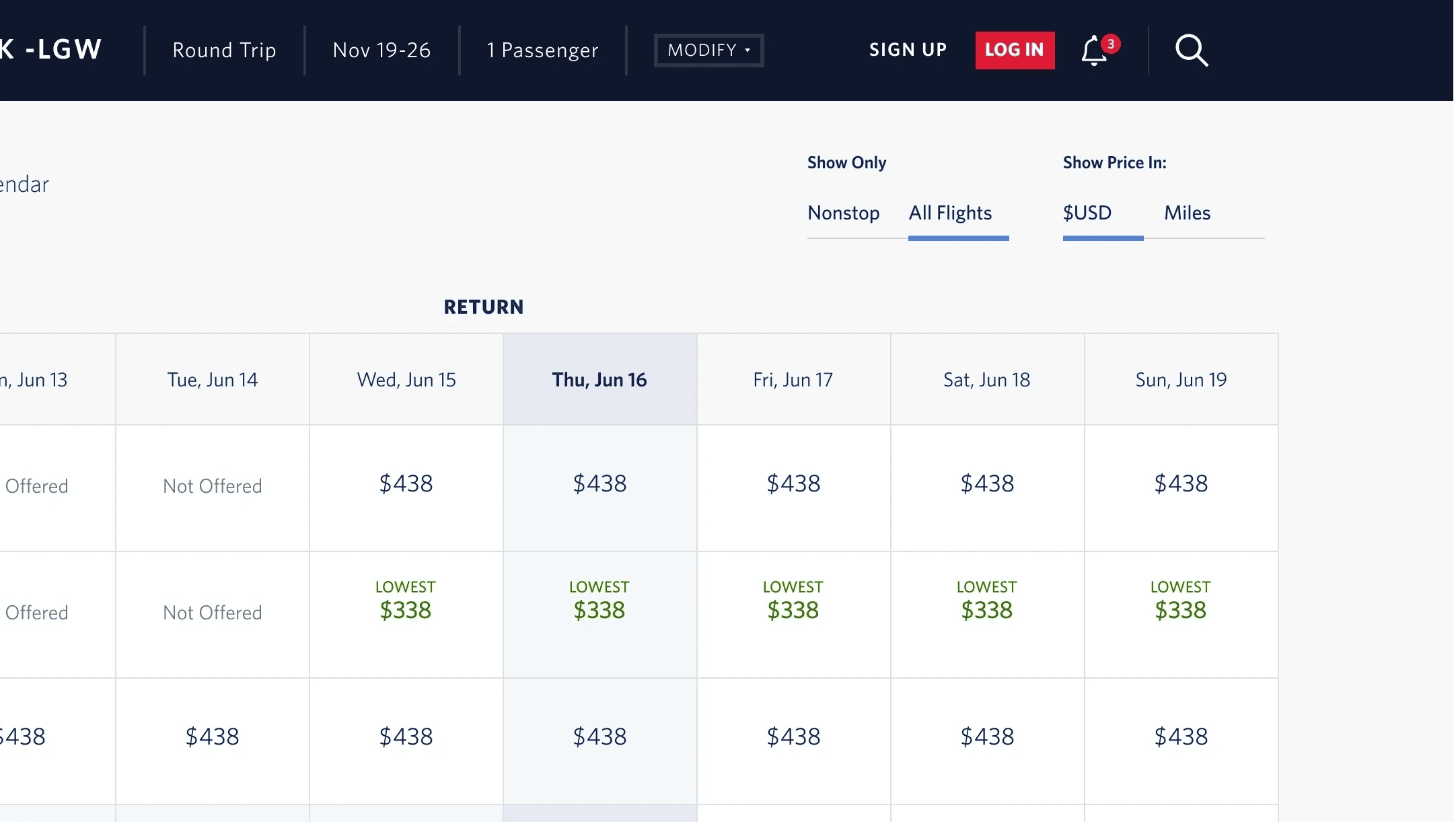
Current design made it difficult for users to find and complete the task of being able to filter flights by leg type and currency. Studies show that visible filter options improve usability by reducing cognitive load and making it easier for users to refine search results. Nielsen Norman Group (NNG) highlights that keeping important controls visible reduces the steps needed to access them, enhancing user efficiency and satisfaction. Users prefer filter options that are immediately accessible on the page rather than hidden in modals or pop-ups, as this allows for quicker adjustments and a more seamless browsing experience .
1.2 Understanding the Problem with Flight Leg Type
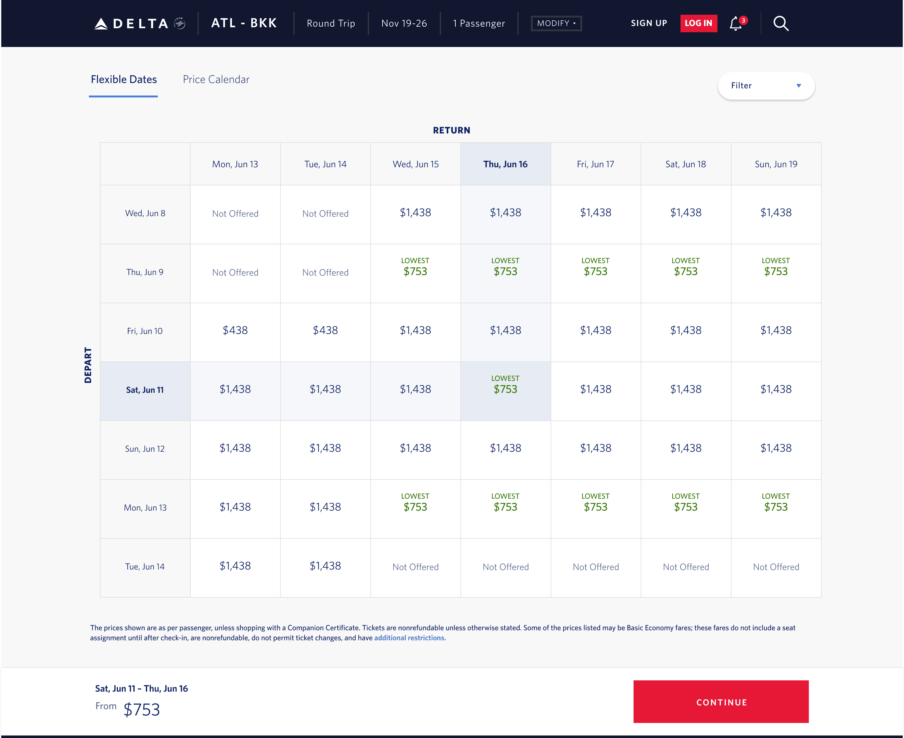
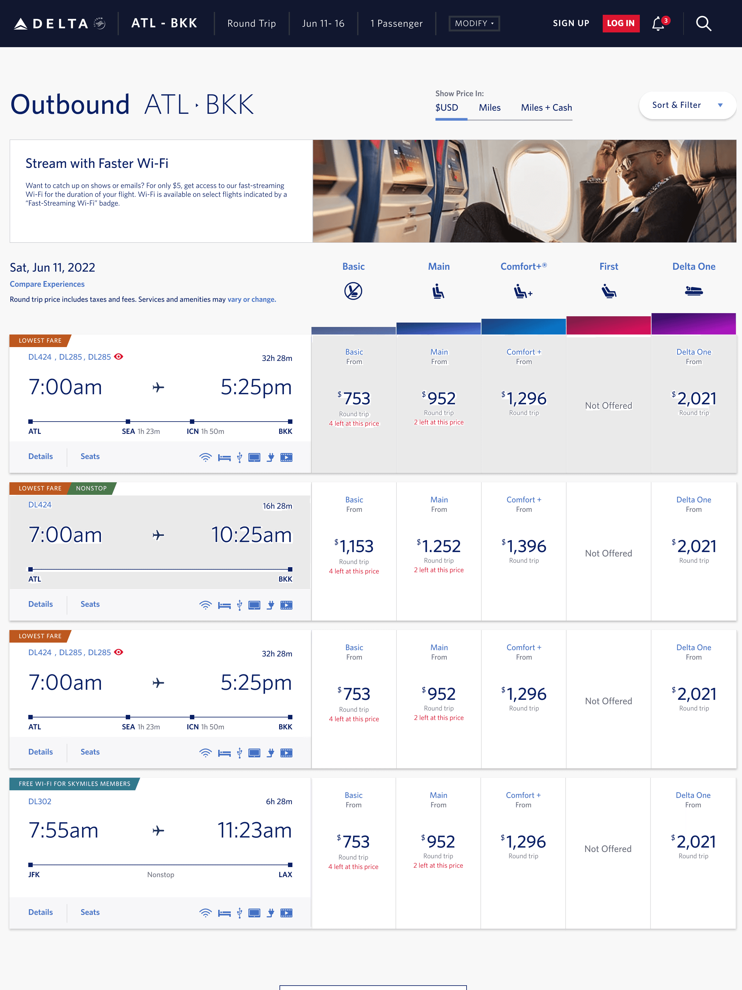
Another issue was that users couldn't easily identify the type of flight associated with the advertised price. Our research showed that users often selected a specific flight and date based on a low advertised price, only to discover later on the flight results page that this price was for a flight with multiple stops. Since most users prefer non-stop flights, this caused frustration and led them to return to the flexible dates page to search for a better option. This back-and-forth disrupted the user experience and made finding a desired flight more difficult.
Research Backed Design
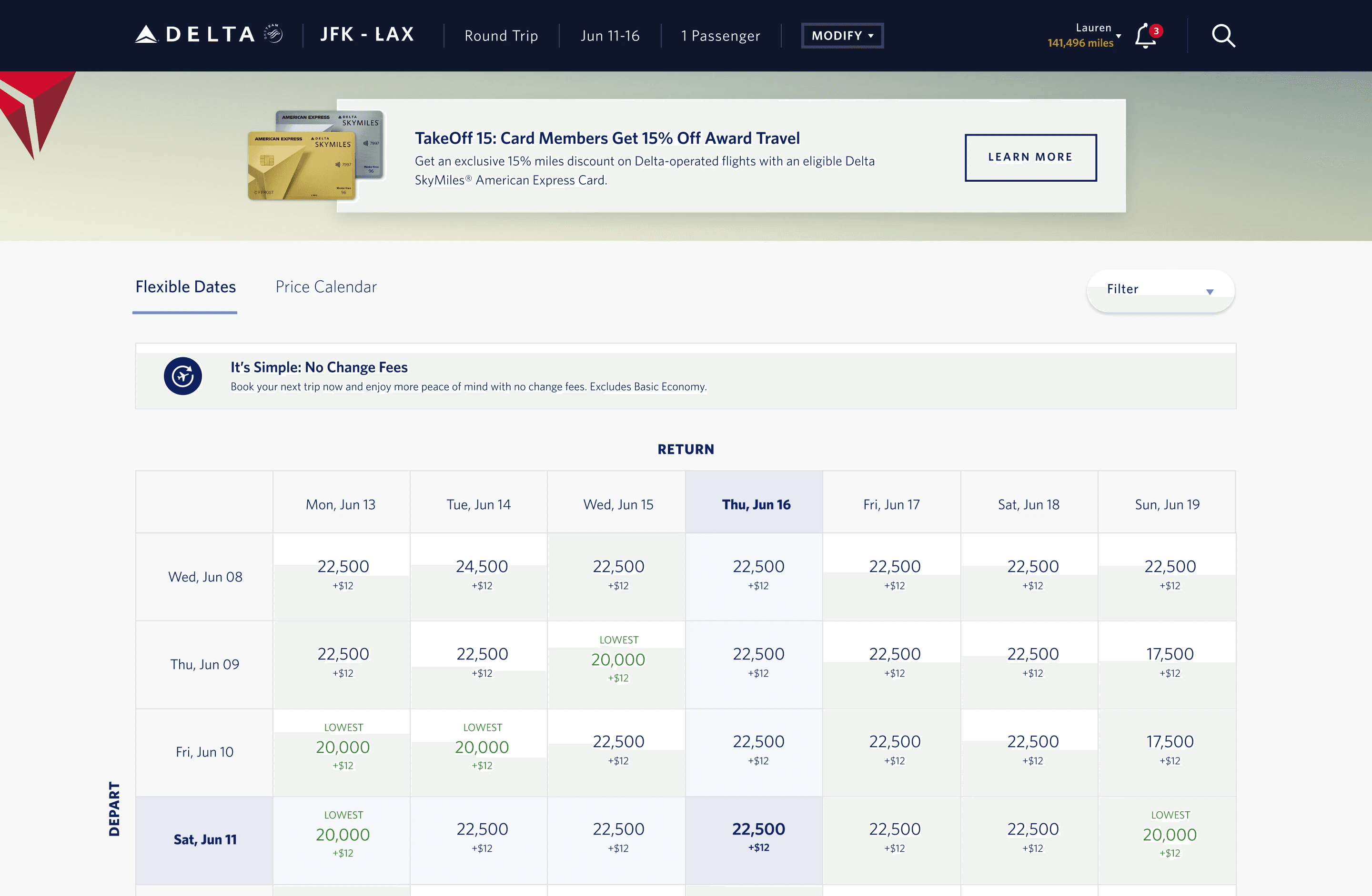
2.1 Moving Filter Options from a Pop-up/Modal to Page
Visibility and Efficiency: Studies show that visible filter options improve usability by reducing cognitive load and making it easier for users to refine search results. Nielsen Norman Group highlights that keeping important controls visible reduces the steps needed to access them, enhancing user efficiency and satisfaction .
User Efficiency: According to Fitts’s Law, the time required to move to a target area is a function of the distance to and the size of the target. Reducing the number of clicks simplifies interactions and minimizes the time users spend on tasks, thereby increasing overall efficiency and user satisfaction .
Task Completion Rates: Research from the Interaction Design Foundation suggests that minimizing the number of clicks to complete a task can significantly enhance user experience and increase task completion rates. Users often abandon tasks that require too many steps .
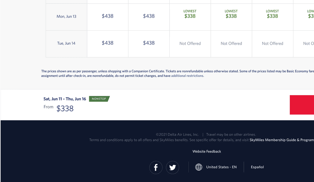
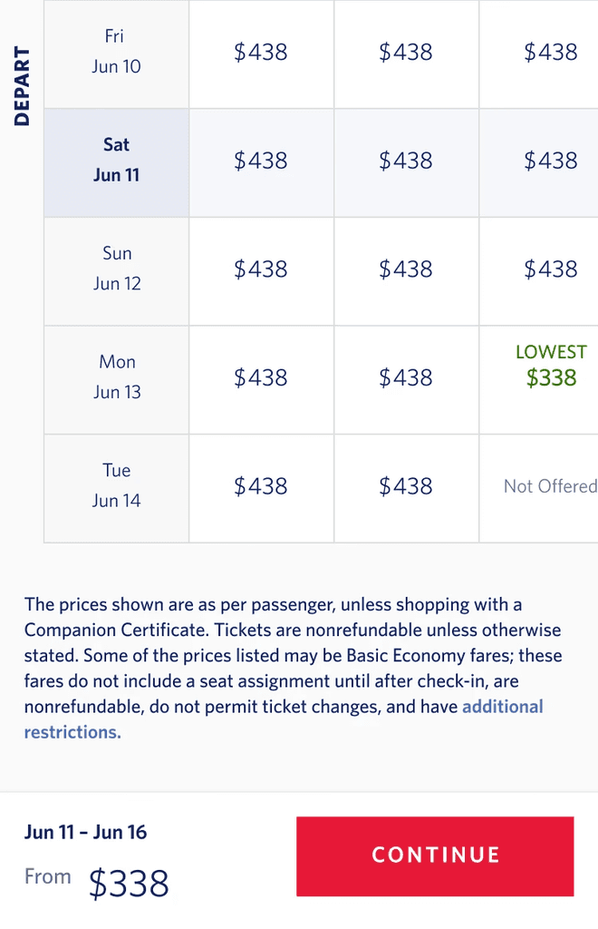
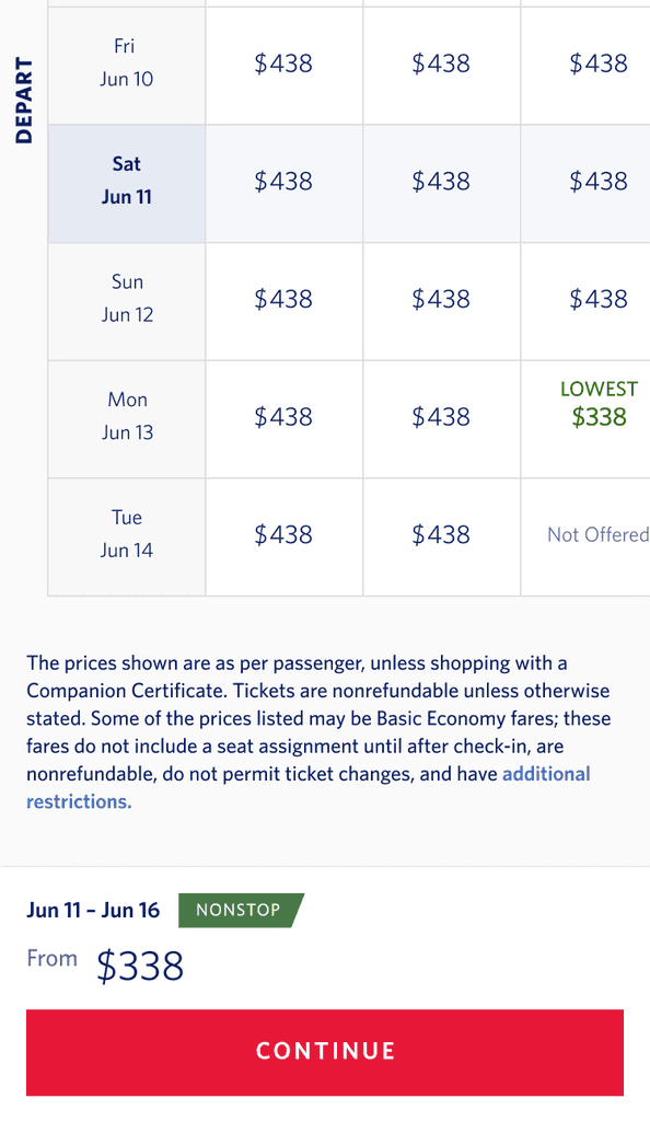
2.2 Creating Badging for Sticky Footer
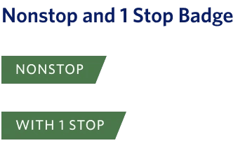
Using a familiar design to increase familiarity with badging in the results pages that follow the flexible pages that show flight leg type.
2.3 Adding Badging to Improve Labeling of Flights
Visual Cues: Badges and labels serve as effective visual cues that help users quickly identify key attributes of search results. NNG emphasizes that clear and distinct badges enhance information scent, helping users to make faster decisions .
Information Retrieval: Studies in human-computer interaction show that additional visual markers like badges improve the speed and accuracy of information retrieval by making important attributes more noticeable .
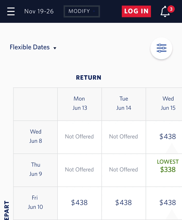
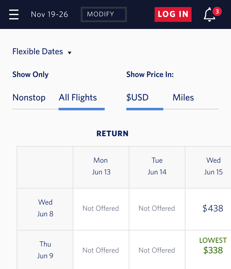
2.4 Translating Filter Design to Mobile View
We applied the same filter optimization to mobile as we did for desktop. Previously, the filter opened a modal on top of the page, requiring multiple steps to adjust search results. Since we only display two filters, there was no need to limit screen space. This makes it easier for users to quickly see and access the filter options, allowing them to narrow down their results more efficiently.
2.5 Translating Badging Design to Mobile View
Mobile Optimization: By adding the badging, items in order shopping flows, and using using large numeral currencies it was determined that it was necessary to adjust the arrangement of information displayed in the mobile experience. We rearranged and created white space on the right of the date and pricing to accommodate various currencies and future badging needs.
Thumb Zone: Research by mobile usability experts shows that the bottom of the screen, known as the “thumb zone,” is the most accessible for touch interactions. Placing the CTA button here improves ease of use and increases interaction rates. Additionally, positioning primary actions at the bottom and creating a larger touch zone enhances mobile usability and accessibility.
Reflection
4.1 Reflecting on the Project
The UX/UI improvements are backed by research in usability and interaction design. Making filter options visible, reducing clicks, optimizing layout according to scanning patterns, using badges for clear labeling, and placing CTAs in the thumb zone all contribute to a more efficient, intuitive, and user-friendly interface. These changes are supported by findings from prominent usability research organizations and are own Delta Airlines research findings.
4.2 Looking Ahead
Looking ahead, our UX/UI improvements set the stage for continuous enhancement. We will integrate ongoing user feedback, focus on personalization, explore advanced technologies, and enhance accessibility. Prioritizing performance optimization and cross-platform consistency ensures a seamless user experience. By leveraging data-driven decisions and considering sustainability, we aim to maintain our leadership in usability and user satisfaction.
